
When a site gets visits but few enquiries, first check who is arriving, what they expect and whether the intended action works. A headline conversion percentage from another business cannot diagnose yours. Separate a measurement gap, an unsuitable audience and a problem with the page.
What happens in your visitor's brain
A visitor needs to recognize the relevant service, understand whether it fits and find the next step. Compare the query or referral with the page's opening. Someone looking for a price needs a clear route to scope and pricing; someone investigating a technical problem needs an answer before a sales form. This is a practical page review, not a claim that every person decides within the same number of seconds.
Trust comes before everything
Make contact details, responsibilities and the offer easy to understand. Use testimonials and project examples that can be checked. Our portfolio provides named work; a result percentage should be published only with a defensible source and context. Trust is not established by adding a badge or an invented success story. The website reliability guide covers other signals to review.
The psychology behind purchase decisions
Describe what the customer receives, what affects the cost and what happens next. Useful comparisons explain genuine differences between options. Availability and deadlines should reflect reality. If visitors struggle to choose, help them identify the relevant scope before adding urgency, more choices or more promotional copy.
Technical problems that kill conversions
Test the entire action on a phone and with a keyboard. Check validation, loading, error recovery and the confirmation after submission. A success message should mean the request was accepted, not merely that a button was pressed. For an online store, review stock, payment failures and order confirmation too. Speed testing is part of this journey; a universal loss-per-second formula is not.
Calls to action that people actually click
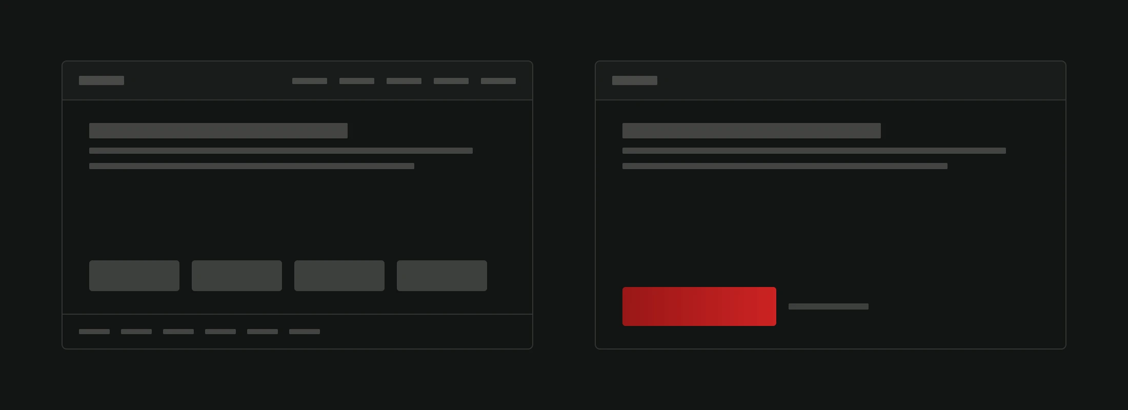
The next action should describe the outcome: request a quote, book a call or check the available dates. Place it where the reader has enough context to choose. A secondary action can help someone who needs more information, but it should not make the main path ambiguous. After submission, state what happened and what the visitor can expect.
Personalization without being creepy
Begin with relevance that does not require identifying the visitor: a campaign can link directly to the appropriate service or product page. If you add behavioral personalization, define the data, permissions and expected benefit. Compare it with the ordinary journey. More tracking is not a substitute for an understandable offer.
The mistakes that cost you money
Review unexpected charges, unclear delivery terms, inaccessible controls and forms that ask for more than the task needs. Also check measurement: count completed actions separately from clicks and page views. On Version2, a received contact request, a confirmed booking and a quote request are different events. None should be presented as a paid sale without payment evidence.
What separates sites that sell from sites that sit
Choose a specific hypothesis, change the affected page and compare results over a suitable period. Account for traffic volume, consent and changes to the offer. For a site review, use the free website analysis; for a new flow or connected system, see web development. The useful outcome is a clearer, working customer journey with evidence about what changed.