Your Site Gets Traffic But No Sales. Here's the Fix

Visitors land on your site and leave without buying. Here is what your site is doing wrong and the specific fixes that turn traffic into customers.

You have traffic. People are coming, looking around, and leaving. Your website is a museum. People walk through, nod, and walk out without buying a thing.

The average e-commerce conversion rate sits at 2-3%. That means 97 out of 100 visitors leave without taking action. But here's what matters: some sites convert at 5%, 8%, even 12%. The difference isn't magic. It's understanding what happens between "I landed on this page" and "I'm ready to buy."

What Happens in Your Visitor's Brain

Within the first three seconds, your visitor makes a gut decision: stay or go. Within ten seconds, they decide if they trust you. Most sites skip straight to the sales pitch, ignoring these two critical steps.

Your site needs to walk visitors through a sequence. First: "Am I in the right place?" Then: "Can I trust these people?" Only then: "What do I need to do next?"

Here's a real example. An online sporting goods store had strong traffic but terrible conversions. The homepage displayed 50+ products at once with no clear navigation. After reorganizing the page structure and adding clear categories, conversion jumped 180%. The traffic didn't change. The experience did.

Trust Comes Before Everything

In Croatia, around 20% of the population has still never made an online purchase. The gap has closed rapidly in recent years, but for those who haven't, the main barrier isn't technology. It's trust.

Trust doesn't come from security badges (though those don't hurt). It comes from showing people who you are.

Tell your actual story. Not a corporate "About Us" page full of corporate language. Your real story. Why you started this business. What you care about. Add photos of your team, your office, your process. Real faces build real trust faster than any certificate. If you want a checklist for making your website more trustworthy, we have a dedicated guide covering every signal that matters.

Don't hide your contact information. If your phone number is buried in the footer, you're telling visitors you don't want to hear from them. Put contact info where people can find it without scrolling. And when they call, answer.

Show real social proof. Testimonials with names and photos. Case studies with specific numbers. Reviews from actual customers. Generic five-star ratings from unknown sources convince nobody. Real stories from real people convince everybody.

The Psychology Behind Purchase Decisions

People buy emotionally and rationalize afterward. The biggest mistake most sites make is focusing entirely on rational arguments. Specifications, features, price comparisons. Important, but not what triggers the decision.

Social proof is the strongest driver. When we see others bought and are satisfied, our resistance drops. Video testimonials are more powerful than written ones. Specific numbers ("saved 40% on hosting costs") beat vague praise ("great service!").

Scarcity works, but only when it's real. "Only 3 left in stock" works because it's verifiable. "Limited time offer!" on a product that's been "limited" for six months insults your visitor's intelligence. Use urgency honestly or don't use it at all.

The paradox of choice is real. When people face too many options, they often choose nothing. If your product page shows 40 similar items with no clear recommendation, you're paralyzing your visitors. Curate. Recommend. Make the choice easier.

Technical Problems That Kill Conversions

You can have perfect copy, beautiful design, and compelling offers. None of it matters if the technical experience is broken.

Speed. Every additional second of load time cuts conversions by roughly 7%. If your site takes 5 seconds to load on mobile, you've lost a third of your potential conversions before anyone reads a word. Fix your site speed before you fix anything else.

Nine stages in order from a tap to a first paint: DNS, TCP and TLS set apart on the left, then GET /, TTFB, HTML, CSS, a marked first contentful paint, and JS last. All stages are drawn the same width, so the figure shows order rather than duration.
Where a second actually goes. A visitor who leaves during the left half never reached anything you wrote, designed or priced.View full-size image

Mobile experience. Over 80% of online browsing in Croatia happens on phones. Mobile optimization doesn't mean the desktop site shrinks to fit a smaller screen. It means buttons are big enough for thumbs. Text is readable without pinching. Forms are short enough to fill out on a bus.

Checkout friction. The average Croatian web store requires account creation, 15 form fields, and 3 terms checkboxes before purchase. That's a conversion killer. The best stores allow purchase in 3 steps: add to cart, enter basic info, pay. Every extra step you add loses a percentage of buyers.

Calls to Action That People Actually Click

"Buy Now" is aggressive. It pushes people to commit before they're ready.

Better CTAs describe the value of clicking. "Start Your Free Trial." "Get an Instant Quote." "Reserve Your Spot." These tell the visitor what happens next, which reduces the anxiety of clicking.

Position matters more than color. There's no magic button color. What matters is contrast (it should stand out from the surrounding content) and position (it should appear where the visitor is ready to act). Put CTAs at the top for visitors who arrive ready. Put them in the middle for visitors who need convincing. Put them at the end for visitors who read everything. Good landing pages test different placements to find what works.

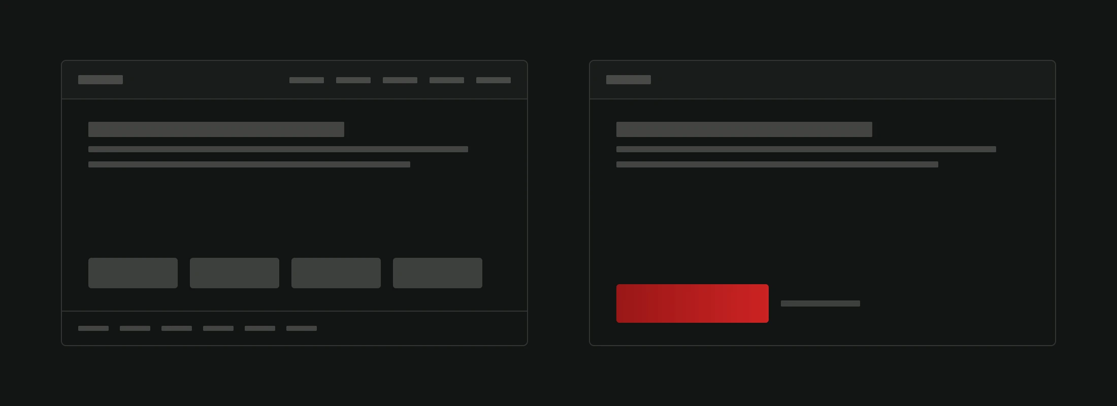
One page, one primary action. If your page has "Buy Now," "Sign Up for Newsletter," "Download Our Brochure," and "Follow Us on Instagram" all competing for attention, none of them win. Decide what each page's main goal is and make that action dominant.

Two wireframes of the same page. The left one has a five item navigation, four buttons of identical size and fill, and a footer of six links. The right one has no navigation links, no footer, one large crimson button and one small quiet link beside it.
The same content, with competing actions on the left and a clear primary action on the right. Use this as a layout comparison, then test the actual choice with your visitors.View full-size image

Personalization Without Being Creepy

Showing every visitor the same generic content ignores a basic reality: different people want different things.

If someone arrives from a Google ad about winter tires, show them winter tires. Not your homepage. Not your full catalog. The specific thing they searched for.

Segment your email marketing. People who bought running shoes don't need an email about business suits. Relevance increases click rates dramatically. Irrelevance trains people to ignore you.

Return visitors are different from new visitors. Someone coming back for the third time probably doesn't need your brand story again. They need the product they were looking at last time, easily accessible.

None of this requires invasive tracking or creepy "we see you" messaging. It just requires thinking about who's visiting and what they likely want.

The Mistakes That Cost You Money

Hidden costs destroy trust instantly. If the visitor discovers shipping fees, taxes, or "processing charges" at the final checkout step, they feel tricked. Show full pricing upfront. If shipping is 5 euros, say it on the product page, not the checkout page.

Missing delivery and return info creates doubt. How much is shipping? How long will it take? What happens if I don't like it? If a visitor has to hunt for these answers, they won't hunt. They'll leave. Clear delivery and return policies aren't just good UX. They're conversion tools.

No clear next step after landing. Visitors arrive, see a nice hero image, some text about your company, and then... nothing obvious to do. Every page needs a clear purpose and a visible next action. If a visitor has to think about what to do next, you've already lost some of them. This is especially critical on your homepage, where the key elements of a good homepage directly determine whether visitors explore further or bounce.

What Separates Sites That Sell From Sites That Sit

It's not design. It's not technology. It's understanding your customer well enough to remove every obstacle between them and the action you want them to take.

Successful sites know what motivates their specific audience. They know what their audience fears. They know how their audience makes decisions. And they build every page around that understanding.

If your site isn't converting the way it should, the problem probably isn't traffic. The problem is friction. Find it. Remove it. Then watch the numbers change.


Want to find out exactly where your site is losing potential customers? We do conversion audits that pinpoint the specific problems and prioritize fixes by impact. Get a free website analysis and see what's holding your numbers back.

Share this article

Related articles

ContactWhatsApp