A well-placed animation makes a website feel polished. A poorly-placed one makes it feel like a PowerPoint from 2004. The difference isn't whether you use animations. It's how, where, and why.
Let's break down when animations genuinely improve a site, when they actively harm it, and how to implement them without killing your page speed.
When animations actually help
Not all animations are created equal. The good ones share a common trait: they serve a purpose beyond looking cool.
Feedback and confirmation
When a user clicks a button and it subtly depresses, that's useful animation. When a form submits and a checkmark appears, that's useful animation. These micro-interactions tell users "your action was registered." Without them, people click twice, get confused, or leave.
A button hover state that shifts color in 200ms. A loading spinner during data fetch. A toast notification that slides in. These animations solve real UX problems.
Guiding attention
Animation is powerful for directing the eye where it needs to go. A subtle pulse on a call-to-action button draws attention without screaming. A progress indicator during a multi-step form shows users where they are and how far they have to go.
Scroll-triggered animations that reveal content sections can make long pages feel structured and intentional rather than overwhelming. The key word is "reveal." The content should appear naturally, not fly in from the left like it's late for a meeting.
Explaining complex ideas
Animated diagrams, step-by-step visual walkthroughs, interactive data visualizations. When you need to explain something complicated, animation can do what static images can't. A pricing calculator that smoothly updates totals as users adjust sliders communicates responsiveness and accuracy.
Branding and personality
A custom loading animation, an animated logo, subtle parallax on a hero section. These tell visitors your brand pays attention to craft. Apple, Stripe, and Linear all use animation as part of their brand identity. It works because it's intentional and consistent.
When animations hurt your site
Here's where most sites go wrong.
The performance tax
Every animation costs something. CSS transitions are cheap. JavaScript-driven animations are expensive. Lottie files and video backgrounds are very expensive.
Here's what happens behind the scenes: the browser needs to repaint and recomposite elements every frame. Animations that trigger layout recalculations (changing width, height, margin, padding) are particularly costly. They force the browser to recalculate the position of everything on the page.
Safe properties to animate: transform and opacity. These are handled by the GPU and don't trigger layout recalculations. Stick to these whenever possible.
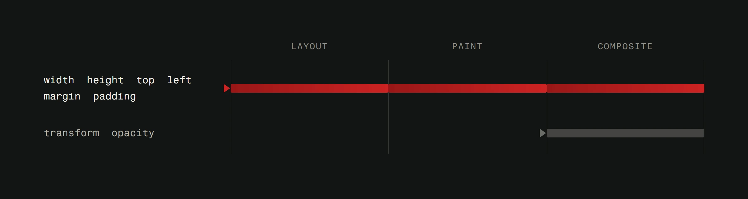
Expensive properties to animate: width, height, top, left, margin, padding. These trigger layout reflows and can tank your frame rate, especially on mobile devices.
A site with heavy animations that runs at 30fps on a mid-range Android phone has failed the performance test. Most of your users aren't browsing on a MacBook Pro.
The distraction problem
When everything moves, nothing stands out. Sites that animate every section on scroll, bounce every button, and parallax every background image are exhausting to use. The user's eye doesn't know where to look, and important content gets lost in the spectacle.
Animation should be salt, not the main course. Season carefully.
The accessibility cost
About 5% of the general population experiences motion sensitivity. For these users, excessive animation can cause dizziness, nausea, or headaches. This isn't a theoretical concern. It's a real accessibility issue with a real technical fix.
The prefers-reduced-motion media query lets you detect users who've requested less motion in their operating system settings. Respecting this preference isn't optional if you care about user experience.
@media (prefers-reduced-motion: reduce) {
  *, *::before, *::after {
    animation-duration: 0.01ms !important;
    transition-duration: 0.01ms !important;
  }
}
This is a blunt approach. Better yet, design your reduced-motion experience intentionally. Maybe fade-ins become instant reveals. Maybe parallax becomes static. The content should be fully accessible either way.
The loading cost
Animated libraries add weight. GreenSock (GSAP) core is about 72KB minified (around 24KB gzipped). Lottie's web player is roughly 334KB (84KB gzipped), though lightweight alternatives like jLottie come in at about 15KB gzipped. Framer Motion for React starts at about 34KB for the motion component, though LazyMotion can reduce that to under 5KB for initial render. These add up, especially when combined with everything else your site loads.
And then there are the animation assets themselves. A Lottie JSON file can easily be 100KB+. A video background can be several megabytes. Every kilobyte is time your user waits before seeing content.
Practical guidelines
Here's a decision framework:
Use animation when:
- It provides feedback on user actions
- It guides attention to important elements
- It explains something that's hard to show statically
- It reinforces brand identity consistently
Skip animation when:
- It's purely decorative with no functional purpose
- It delays the user from reaching content
- It doesn't work well on mobile devices
- You can't implement a reduced-motion alternative
Technical rules:
- Keep animations under 300ms for UI feedback. Anything longer feels sluggish.
- Use CSS transitions for simple state changes. Reserve JavaScript animation libraries for complex sequences.
- Animate only
transformandopacityunless you have a very good reason. - Test on real devices. Chrome DevTools' performance panel and a mid-range phone are your best friends.
- Always implement
prefers-reduced-motionsupport. - Lazy-load animation libraries. If the animation is below the fold, don't load the library until the user scrolls near it.
The best animation is the one you don't notice
Great animation feels invisible. The user doesn't think "cool animation." They think "this site feels good." That's the goal.
The sites that win awards for animation (think Awwwards or CSS Design Awards) are often terrible to actually use. They prioritize spectacle over function. Your site should prioritize function over spectacle.
Build a fast, usable site first. Then add animation where it genuinely helps. If you're unsure whether an animation adds value, remove it and see if anyone notices. If nobody does, it wasn't adding value.
A responsive, accessible site that loads in 2 seconds with zero animations will outperform an animation-heavy site that takes 6 seconds every single time. Start with speed. Add polish carefully.
Building a site and wondering where animation would actually help? See how we approach web design or get in touch. We build sites where every animation earns its place.