Most "best free fonts" articles throw 30 options at you with zero context about how they actually perform on a website. That's not helpful. You don't just need a font that looks good in a design tool. You need one that loads fast, renders cleanly across devices, and supports the languages your audience reads.
Here are six fonts worth your time. Each one is free, web-optimized, and chosen for a specific use case. Not filler picks. Real recommendations from a team that builds websites daily.
Why font choice matters more than you think
Before we get to the list, let's talk about why this decision matters on the web specifically.
A font on a poster just needs to look good. A font on a website needs to look good, load fast, render sharply at small sizes, work across operating systems, and support multiple character sets. That's a completely different set of requirements.
Every custom font you add to a website is an extra file the browser has to download. One font family with four weights can easily add 200KB to your page load. On a slow mobile connection, that's the difference between a site that feels snappy and one that shows blank text for two seconds.
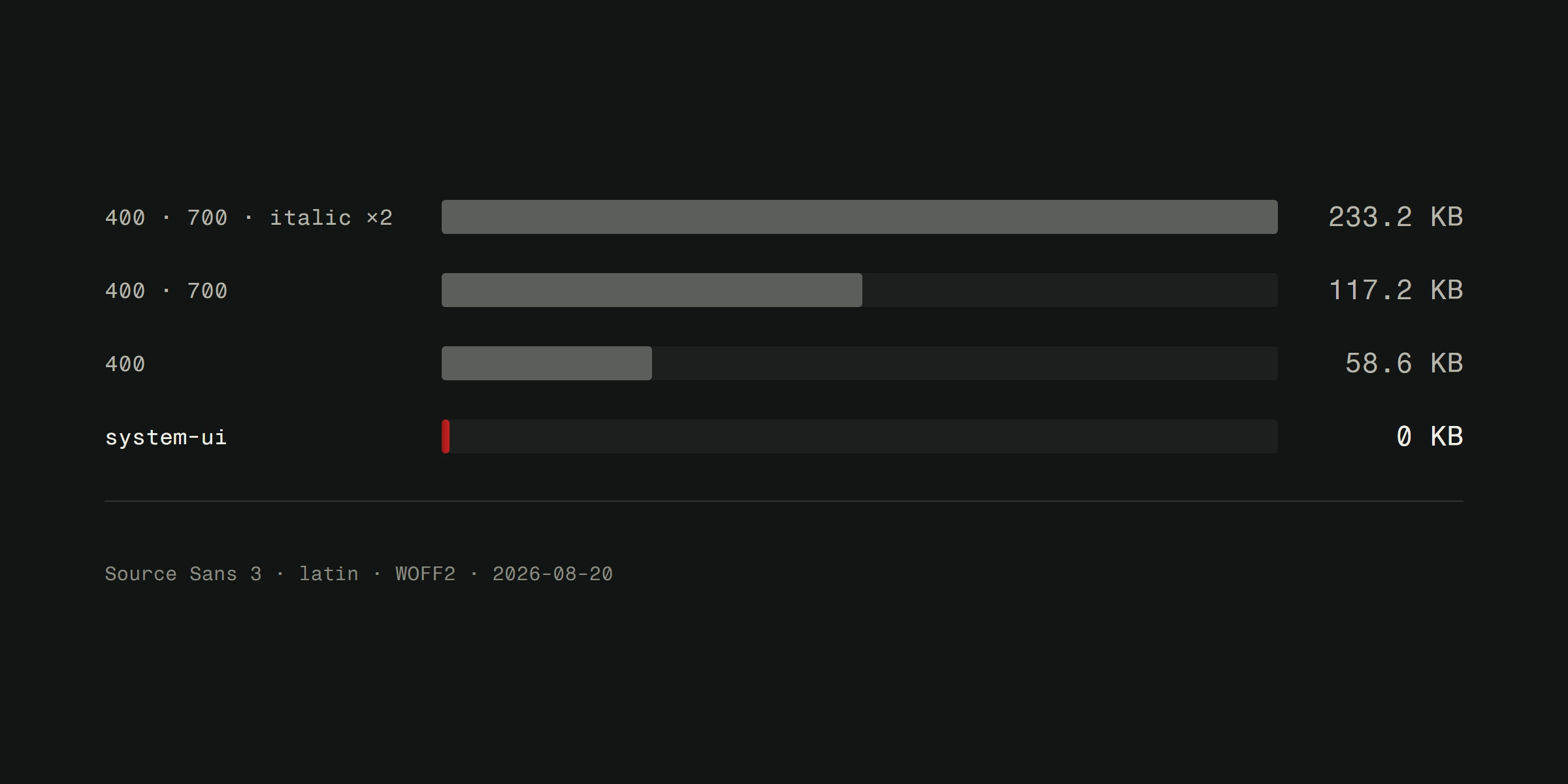
Performance-conscious font selection isn't optional. It's part of good web design. For a deeper look at how typography choices affect your visitors, read our guide on choosing the right font.
Gelasio
Best for: Body text where you want personality without sacrificing readability.
Gelasio is a serif font that works surprisingly well on screens. It was designed as a metric-compatible alternative to Georgia, which means you can use it as a web font and fall back to Georgia without layout shifts.
The letterforms are warm and readable at paragraph sizes. It's not flashy, but that's the point. For long-form content like blog posts and service descriptions, you want a font that disappears into the reading experience.
Web performance note: Gelasio is available through Google Fonts CDN, which means most visitors will already have it cached. Load only the weights you need. Regular and bold cover 90% of use cases.
Space Grotesk
Best for: Tech-forward brands and SaaS websites.
Space Grotesk is a proportional sans-serif with a geometric skeleton and some quirky details. The open apertures and slightly squared curves give it a technical feel without being cold.
It works beautifully for headlines and UI elements. Pair it with a neutral body font like DM Sans or Inter and you've got a type system that feels modern and intentional.
Web performance note: The variable font version is only about 50KB for the full weight range. That's excellent. Use the variable version and let CSS handle the weight adjustments.
DM Sans
Best for: Clean interfaces, dashboards, and websites that need to feel professional without being boring.
DM Sans is one of those fonts that just works everywhere. It's geometrically precise, incredibly legible at small sizes, and neutral enough to pair with almost anything.
If you're building a business website and don't want to overthink the typography, DM Sans is a safe, smart choice. It handles body text, navigation, buttons, and headings equally well. It's the kind of font where nobody will complain, and that's actually a compliment.
Web performance note: The variable font file is compact. Load it from Google Fonts or self-host for even better performance. Two weights plus italic covers most projects.
Playfair Display
Best for: Headlines on luxury, hospitality, and lifestyle websites.
Playfair Display is a high-contrast serif with dramatic thick-thin transitions. It screams sophistication when used for large headings. Hotels, restaurants, fashion brands, wine shops. Anywhere the vibe is "upscale but approachable."
A word of caution: don't use it for body text. The high contrast that makes it stunning at 48px makes it a nightmare at 16px. Pair it with a clean sans-serif for body copy. The contrast between the two creates visual hierarchy that draws the eye exactly where you want it.
Web performance note: Playfair Display is heavier than most serif fonts. Limit yourself to one or two weights and use font-display: swap to prevent invisible text during loading.
Aspekta
Best for: Brand identity systems and modern corporate websites.
Aspekta is a contemporary sans-serif that manages to feel both friendly and authoritative. The character widths are consistent, the x-height is generous, and it comes in a wide range of weights from thin to black.
What sets it apart is precision. Every letterform feels deliberate. It's the kind of font that makes a logo text feel designed, not just typed. If you're building a brand identity alongside a website, Aspekta gives you consistency across both.
Web performance note: Since this isn't on Google Fonts, you'll need to self-host. Convert to WOFF2 format, subset to only the characters you need, and preload the font file in your HTML head for fastest rendering.
Instrument Serif
Best for: Editorial content, magazines, and portfolios.
Instrument Serif is elegant without being precious. The letterforms have a calligraphic quality that adds warmth to editorial layouts. It works for headlines and pull quotes on content-heavy sites.
It pairs naturally with Instrument Sans (same family, different style) for a cohesive type system. Or mix it with a geometric sans-serif for more contrast. Either approach works.
Web performance note: Lightweight and available as a variable font. A great option for sites where performance and aesthetics need to coexist. And on the web, that's every site.
How to choose between them
Here's a quick decision framework.
Building a blog or content site? Gelasio for body text, Space Grotesk or DM Sans for headings.
Building a SaaS or tech product? DM Sans everywhere, or Space Grotesk for headings with DM Sans for body.
Building a luxury or lifestyle brand? Playfair Display for headlines, DM Sans or Gelasio for body.
Building a corporate site with strong branding? Aspekta across the board. It has enough weights to handle every element.
Building an editorial or portfolio site? Instrument Serif for display text, paired with a neutral sans-serif.
Remember that the best typography isn't about finding the perfect font. It's about creating a system where fonts, sizes, weights, and spacing work together. Colors play a big role in that system too. Read about how colors affect user experience for the full picture.
The performance checklist
Before you ship any custom font to production, run through this.
- Use WOFF2 format. It's the most compressed and has broad browser support.
- Subset your fonts. If your site is in English, you don't need Cyrillic or Vietnamese character sets.
- Use
font-display: swapto prevent invisible text while fonts load. - Limit weights. Every additional weight is another file download. Be ruthless.
- Consider variable fonts. One file, every weight. Usually smaller than loading three separate weight files.
- Preload your primary font. Add a preload link in your HTML head so the browser fetches it early.
Good typography is invisible. Bad typography is all anyone sees. Pick a font that serves your content, optimize it for the web, and move on to the next thing.
Need help choosing and implementing typography for your website? Take a look at our web design services or read more about selecting the right font for your project.