
People form an opinion about your website in about 50 milliseconds. Up to 90% of that snap judgment is based on color alone. Not your copy. Not your layout. Color.

That makes your color palette one of the most important design decisions you'll make. But most advice on "color psychology" is oversimplified to the point of being useless. Let's look at what actually matters.
The problem with generic color psychology
You've seen the lists. Blue means trust. Red means urgency. Green means nature. Yellow means happiness.
These aren't wrong, but they're incomplete to the point of being misleading. Cultural context matters enormously. Personal experience matters. Industry expectations matter. A red "Buy Now" button works on an e-commerce site not because red is inherently urgent, but because users have been trained by decades of red sale tags and "clearance" signage.
The more useful question isn't "what does blue mean?" It's "what do my specific users expect to see, and how can color support their experience on my site?"
Color and trust
Trust is where color decisions have the biggest measurable impact on business websites.
Financial services, healthcare, and legal sites overwhelmingly use blue, dark green, or navy. Not because these industries lack creativity, but because their users expect stability and seriousness. A neon pink banking app would feel wrong, even if the UX was perfect.
Consistency builds trust more than any specific color. If your brand uses a particular blue across all materials, your website should use that same blue. Color inconsistency between your business cards, storefront, and website creates a subtle sense that something is off.
The other trust killer: too many colors. Limit your palette to 2-3 primary colors plus neutrals. Sites with 7 different accent colors look amateur, regardless of which colors you pick.
Color and conversion
This is where color gets directly tied to revenue. Your call-to-action buttons need to stand out from the rest of the page. That's not about a specific color being "better" for CTAs. It's about contrast.
An orange button on a blue site pops. A blue button on a blue site disappears. The highest-performing CTA color on your site is whatever color contrasts most with your background and isn't used elsewhere.
HubSpot famously tested red vs. green buttons and found red outperformed by 21%. But that wasn't because red is a better CTA color universally. Their site was heavily green, so the red button stood out more. Context always wins.
Practical rules for CTA colors:
- Pick a color that doesn't appear elsewhere on the page
- Ensure at least a 3:1 contrast ratio against the background
- Use the same CTA color consistently across your entire site
- Test it. A/B testing your CTA color for even one week gives you more useful data than any color psychology article
Building a functional color palette
Start with these layers:
Primary color. Your brand's main color. Used for your logo, main navigation, key headings. This is your visual identity.
Secondary color. Complements the primary. Used for less prominent elements, secondary buttons, icons, highlighted sections. Should feel natural next to your primary color.
Accent color. Reserved for CTAs and elements that need maximum attention. Used sparingly. If everything is accented, nothing is.
Neutrals. White, black, grays. These make up 60-70% of your site's visual space. They're the canvas that lets your brand colors breathe. Get these wrong (too warm, too cool, too dark) and the whole site feels off.
Semantic colors. Red for errors. Green for success. Yellow for warnings. Blue for information. Don't repurpose these. If your brand color is red, your error states need a different shade of red or users will confuse brand elements with error messages.
Contrast and accessibility
This is the part most designers skip and most users notice. If your text doesn't have enough contrast against its background, a significant portion of visitors literally cannot read it.
WCAG 2.2 guidelines require:
- 4.5:1 contrast ratio for normal text
- 3:1 for large text (18px bold or 24px regular)
- 3:1 for UI components and graphical objects
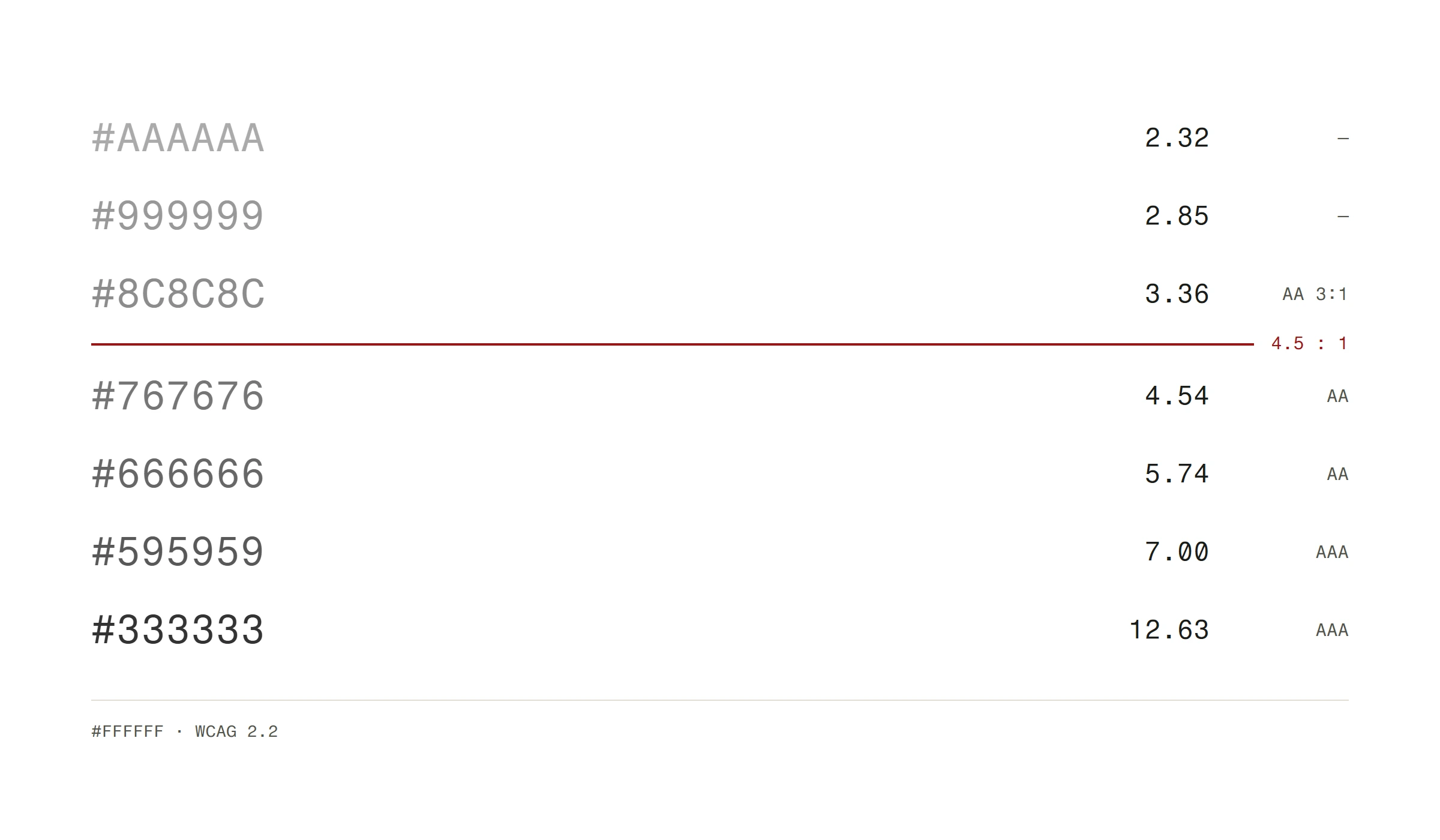
That light gray text on a white background that looks "clean and minimal"? It fails accessibility standards and frustrates anyone over 40, anyone in bright sunlight, and anyone with even mild visual impairment. That's a lot of your audience.
Tools to check contrast:
- WebAIM Contrast Checker (free, browser-based)
- Stark plugin for Figma
- Chrome DevTools (inspect any element and it shows the contrast ratio)
Don't guess. Check every text-background combination on your site.
Dark mode considerations
More than 80% of smartphone users enable dark mode. If your site doesn't handle it, you're delivering a jarring experience to the majority of mobile visitors.
Dark mode isn't just inverting colors. Pure white text on pure black backgrounds causes halation (a glowing effect) and eyestrain. Use off-white (#E0E0E0 or similar) on dark gray (#121212 or similar) instead. A dark color palette can be a deliberate brand choice that makes photography pop while keeping contrast ratios accessible.
Your brand colors need dark mode variants too. A vibrant blue that works on white might be blinding on a dark background. Desaturate and lighten your accent colors for dark mode.
CSS makes this straightforward:
@media (prefers-color-scheme: dark) {
  :root {
    --bg-primary: #121212;
    --text-primary: #E0E0E0;
    --accent: #64B5F6; /* lighter variant of your brand blue */
  }
}
Color mistakes that kill conversions
Too many competing colors. Every color on your page competes for attention. More colors means more cognitive load. More cognitive load means higher bounce rates.
CTA blends into the page. If visitors need more than half a second to find your primary action button, you've lost conversions.
Ignoring cultural context. White represents purity in Western cultures but mourning in some East Asian cultures. If you serve international audiences, research how your palette reads across cultures. These are the kinds of web design dos and don'ts that separate professional results from amateur ones.
Using color as the only indicator. About 8% of men and 0.5% of women have some form of color blindness. If your form uses only red/green to indicate errors/success without text labels or icons, those users are lost.
Inconsistent shades. Using five different blues across your site looks sloppy. Define your exact hex values in a design system and stick to them. No eyeballing.
Practical steps
- Audit your current site with a contrast checker. Fix anything below WCAG AA standards.
- Define a strict color palette: 1 primary, 1 secondary, 1 accent, 3-4 neutrals, 4 semantic colors.
- Ensure your CTA color appears nowhere else on the page except on clickable actions.
- Test dark mode. At minimum, make sure your site is usable when the OS is in dark mode.
- A/B test your CTA color with real traffic for at least one week before deciding.
Color is one of the key elements of a good homepage that visitors judge within the first three seconds, so getting it right pays dividends across your entire site.
Color isn't decoration. It's user experience infrastructure. Get it right and everything else on your site works harder.
Not sure if your color palette is helping or hurting? Send us your URL and we'll give you a free website analysis with actionable feedback.