Most landing pages fail. Not because they're ugly, but because they try to do too much.
A landing page has one job: get the visitor to do one specific thing. Sign up. Buy. Book a call. Download. That's it. Every element on the page should push toward that single action.
One page, one goal
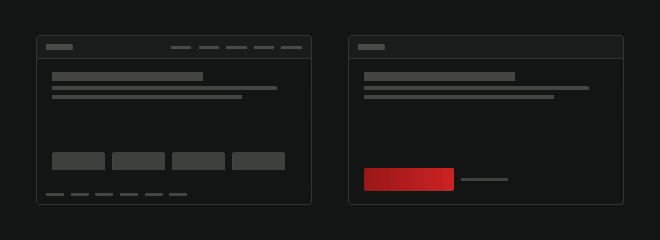
This is the rule most people break. They add navigation bars, footer links, multiple offers, social media icons, blog teasers. Every one of those is an exit. A distraction from the thing you actually want the visitor to do.
Strip it down. Remove everything that doesn't serve the conversion goal.
The average landing page converts at 2-5%. Top performers hit 10%+. The difference isn't budget or fancy design. It's focus. Every link that isn't your CTA is a leak in the funnel.
The anatomy of a page that works
A headline that answers "What's in it for me?"
You have about 5 seconds before someone decides to stay or leave. Your headline needs to communicate the value immediately.
Bad: "Welcome to Our Service" Better: "Get More Leads Without Spending More on Ads" Best: "We Helped 200+ Businesses Double Their Leads. Here's How."
The headline isn't about you. It's about the visitor and what they get.
A subheadline that adds specifics
The headline hooks. The subheadline explains.
"Our free audit identifies the 3 biggest conversion blockers on your website. Results in 48 hours."
Keep it one or two sentences. Specific. No fluff.
Social proof
People do what other people do. Testimonials, client logos, case studies, review scores. Pick whatever you have and put it early on the page.
Numbers work well: "Trusted by 500+ businesses" or "4.9/5.0 on Google Reviews."
Don't fabricate it. Real social proof beats polished marketing copy every time. Even a simple "Join 1,200 businesses already using this" creates momentum. People want to feel like they're making a safe choice, not being a guinea pig.
The offer, explained simply
What exactly are you offering? What does the visitor get? When do they get it?
Use bullet points. Three to five benefits. Be specific.
- Bad: "Comprehensive website analysis"
- Good: "Speed test, SEO audit, mobile check, security scan. Delivered as a PDF in 2 business days."
One clear CTA
The call-to-action button is the most important element on the page. It should be:
- Visible. High contrast color. Big enough to tap on mobile.
- Specific. "Get My Free Audit" beats "Submit." "Start My Trial" beats "Click Here."
- Repeated. Place it after the headline, after the benefits, and at the bottom. The visitor should never have to scroll to find it.
A form that doesn't scare people
Every field you add to a form reduces completions. Ask for the absolute minimum.
For lead generation: name and email. Maybe phone. That's it.
For a purchase: only what's needed to complete the transaction.
If you need more information, collect it after the initial conversion.
Speed matters more than design
A landing page that loads in 1 second converts 3x better than one that loads in 5. Optimize your page speed before you worry about the color of your CTA button.
Test everything
A/B testing is how you turn a good landing page into a great one.
Test one element at a time:
- Headline A vs. Headline B
- Green button vs. Orange button
- Short form vs. Long form
- Video hero vs. Image hero
Run each test for at least 2 weeks or 1,000 visitors before drawing conclusions. Statistical significance matters. A test with 50 visitors tells you nothing.
Tools for A/B testing: Google Optimize was retired in 2023, but alternatives are plentiful. Posthog offers a free tier. VWO and Optimizely handle enterprise needs. Even simple tools like Carrd or Unbounce have built-in split testing for landing pages.
The biggest wins usually come from headline and CTA changes, not design tweaks. A new headline can change what a visitor thinks the page offers. A new button color rarely changes much.
Common mistakes
- Too many CTAs. Pick one action. Not three.
- Navigation links. Remove the header nav. This isn't a regular page.
- Vague headlines. If your headline could apply to any company in your industry, it's too generic.
- No mobile optimization. Most traffic is mobile. Test your responsive design. Understanding what makes your website trustworthy also applies to landing pages: visitors judge credibility within milliseconds.
- Ignoring load speed. The prettiest page means nothing if nobody waits for it to load.
- Never testing. Gut instinct is not data. Test and iterate.
The bottom line
A great landing page is simple, fast, specific, and focused on one action. It respects the visitor's time and makes the next step obvious.
You don't need a complicated design. You need clarity. Track your conversion rate from day one using Google Analytics 4 event tracking or a dedicated tool. If you're below 2%, something fundamental is off. Revisit your headline, offer, or page speed. If you're between 2-5%, start A/B testing to climb higher.
If you are just starting out and wondering what information to prepare before starting a web project, landing page goals should be part of that conversation from day one.
Need a landing page? We design and build them for one clear goal, and nothing goes on the page that doesn't serve it.