Your homepage has about 3 seconds. That's how long a visitor takes to decide if they'll stay or hit the back button. In those 3 seconds, your page needs to answer one question: "Am I in the right place?"
Every element on your homepage exists to answer that question with a confident yes. Let's break down what those elements are and how to get them right.
The hero section: Your opening statement
The hero section is the first thing visitors see. It sits above the fold (the part of the page visible without scrolling) and it carries the entire weight of that 3-second first impression.
A good hero section has three components.
A clear headline. Not clever. Not vague. Clear. Your visitor should understand what you do and who you do it for in one sentence. "Custom websites for Croatian businesses" works. "Bringing your digital dreams to life" does not.
A supporting subheadline. One or two sentences that add context. Explain the benefit. Answer the "why should I care?" question. Keep it short. People scan. They don't read.
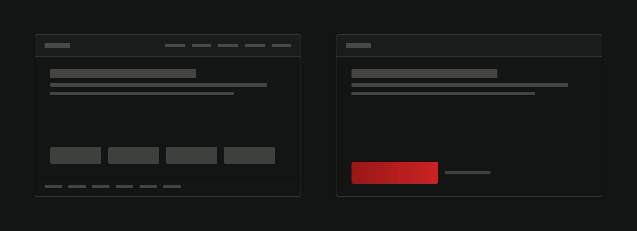
A primary call to action. One button. One action. "Get a free quote." "See our work." "Start your project." Don't give people five options. Give them one obvious next step. The psychology behind effective CTAs is worth studying.
What about hero images or videos? They help when they're relevant. A video of your product in action. A photo of your team at work. What doesn't help: generic stock images of handshakes, computers, or city skylines. If the image doesn't communicate something specific about your business, it's just decoration.
Navigation: The map of your site
Navigation is the single most functional element on your homepage. Get it wrong and nothing else matters because people can't find anything.
Keep your main navigation to 5-7 items. More than that creates decision paralysis. Research consistently shows that fewer choices lead to more action.
Use clear, descriptive labels. "Services" beats "What We Do." "Pricing" beats "Investment." "Blog" beats "Insights & Resources." Don't make people guess what's behind a link.
Put the most important items first and last. People remember the first and last items in a list better than the middle ones. This is called the serial position effect. Use it.
Include a visible contact option. Whether it's a "Contact" link in the nav or a phone number in the header, make it effortless to reach you. Every extra click between "I want to talk to someone" and actually being able to costs you conversions.
For larger sites, a search function is not optional. If someone lands on your page looking for something specific and can't find it in 10 seconds, they're gone.
Social proof: Let others sell for you
You can say you're great all day long. It doesn't move the needle like someone else saying it.
Place social proof early on the homepage. Not buried at the bottom. Within the first scroll or two. This means testimonials, client logos, review scores, or case study previews should be high up.
The best testimonials are specific. A quote with a name, photo, company, and specific result. "Increased our online orders by 45% in the first month" is persuasive. "Great team to work with" is not.
If you're a new business without testimonials, show other trust signals. Years of experience. Number of projects completed. Relevant certifications. Industry associations. Something that says "we're real and we know what we're doing."
Value proposition sections: Why you, not them
Below the hero, your homepage needs to quickly communicate what you offer and why you're different.
Keep these sections focused. Each one should cover one idea. One service. One benefit. One differentiator. Short headline. Two or three sentences of explanation. Maybe a relevant icon or image.
Avoid the trap of listing every single thing you do. Your homepage is a gateway, not an encyclopedia. Link to detailed service pages for the full story.
Think about the questions your visitors are asking:
- What do you do? (Services overview)
- Who do you do it for? (Target audience)
- Why are you different? (Differentiators)
- How does it work? (Process overview)
Answer these in order and you'll guide visitors through a natural decision-making process.
Visual design: Making it feel right
Design isn't decoration. It's communication. Every visual choice on your homepage sends a message.
White space is your friend. Empty space between elements makes content easier to read and gives the page a premium feel. Cramming everything together looks desperate and overwhelming.
Visual hierarchy tells people where to look. Bigger text is more important. Bolder colors draw attention. Position on the page implies priority. Use these principles intentionally.
Consistency builds subconscious trust. Same button styles throughout. Same heading sizes for same-level content. Same spacing patterns. When things are consistent, the page feels professional even if visitors can't articulate why.
Images should be high quality and relevant. Compress them for fast loading but don't sacrifice visual quality. Blurry or pixelated images make your whole business look low-quality.
Your homepage should look good on every screen size. Responsive design isn't just a technical checkbox. It's the difference between a visitor staying or leaving on mobile.
The footer: More important than you think
Most people design the footer as an afterthought. That's a mistake. Your footer is the safety net for visitors who scrolled the entire page without finding what they need.
A good footer includes:
- Contact information. Phone, email, physical address. Make it easy to reach you.
- Quick links. Important pages that might not be in the main nav. Legal pages, FAQ, sitemap.
- Social media links. If you're active on social platforms, link to them here.
- A secondary CTA. One more chance to convert. "Start your project" or "Get a free quote."
- Legal essentials. Privacy policy, terms of use, cookie policy. Required by law in many jurisdictions.
Don't neglect the footer's design. It should feel like a natural conclusion to the page, not a dumping ground for leftover links.
Speed: The invisible element
None of this matters if the page doesn't load quickly. A homepage that takes 4+ seconds to load loses over half its visitors. They never even see your carefully crafted headline or social proof.
Aim for under 2 seconds on desktop. Under 3 on mobile. This means optimized images, minimal JavaScript, proper caching, and good hosting.
Speed is also a ranking factor. Google has been clear about this. A slow homepage doesn't just lose visitors. It gets less traffic from search in the first place.
The mistake most homepages make
The biggest mistake? Trying to say everything on one page. Your homepage should do the same job as a good book cover: communicate what this is about and make someone want to open it.
Each section should have one purpose and one logical next action. Read more about this service. See our work. Check our pricing. Contact us. The homepage is the starting point of many journeys, not the destination.
Good UX means respecting your visitor's time and attention. Give them what they need to make a decision. Nothing more.
Need a homepage that earns trust and drives action from the first scroll? See how we approach web design and what it looks like in practice.