Every year brings a new wave of "top design trends" articles. Most of those trends are forgotten within 18 months. What actually sticks are principles. Ideas rooted in how people think, read, and make decisions on the web.
This is not a trend list. It is a guide to design thinking that keeps working year after year.
Minimalism is not about less stuff
Minimalist design gets misunderstood constantly. People think it means white backgrounds, thin fonts, and lots of empty space. That is the aesthetic of minimalism, not the principle.
Real minimalism is about removing everything that does not serve the user. Every element on the page should earn its place. If it does not help someone understand your message, find what they need, or take the next step, it is clutter.
This applies to navigation menus with 15 items. To homepage sliders that nobody clicks past the first slide. To decorative elements that look nice but slow down the page and distract from the content.
The goal is clarity. When a user lands on your site, they should understand what you do and what to do next within a few seconds. That is minimalism. Whether you achieve it with a white background or a dark one is just style.
For a deeper look at how visual design affects behavior, read about how colors shape user experience.
Dark mode as an accessibility feature
Dark mode used to be a novelty. Now it is an accessibility expectation. Most operating systems and browsers support it natively. Users who enable it expect websites to respect that choice.
From a practical standpoint, dark mode reduces eye strain in low-light environments. It can also lower battery consumption on OLED screens. But the bigger reason to implement it is simple: respect user preferences.
Implementing dark mode well requires more than inverting your colors. Contrast ratios need to work in both modes. Images with transparency need appropriate backgrounds. Text readability must be tested in both light and dark contexts.
The best approach is to use CSS custom properties for your color system. Define your palette once, swap it based on the user's system preference, and give them a manual toggle as a fallback. Clean implementation. No JavaScript hacks.
AI in the design workflow
AI is not replacing designers. But it is changing how design work gets done.
The practical applications are more mundane than the hype suggests. AI tools can generate layout variations, suggest color combinations, or resize assets for different breakpoints. They handle repetitive tasks that used to eat hours of a designer's week.
Where AI gets more interesting is in personalization. A website can adapt its content, layout, or recommendations based on user behavior. Someone who has visited your pricing page three times probably does not need to see your "About Us" pitch again. They need a clear path to purchase.
But personalization comes with responsibility. Users should not feel watched. The line between "helpful" and "creepy" is thin. Good personalization feels like the site understands what you need. Bad personalization feels like surveillance.
The principle here is not about using AI for its own sake. It is about using any tool, AI or otherwise, to reduce friction between the user and their goal.
Typography carries more weight than you think
Most websites look the same. Same layout. Same stock photos. Same sans-serif font at the same sizes.
Typography is one of the fastest ways to differentiate. A well-chosen typeface communicates personality before anyone reads a single word. It sets the tone. Professional. Friendly. Technical. Playful. The font does heavy lifting.
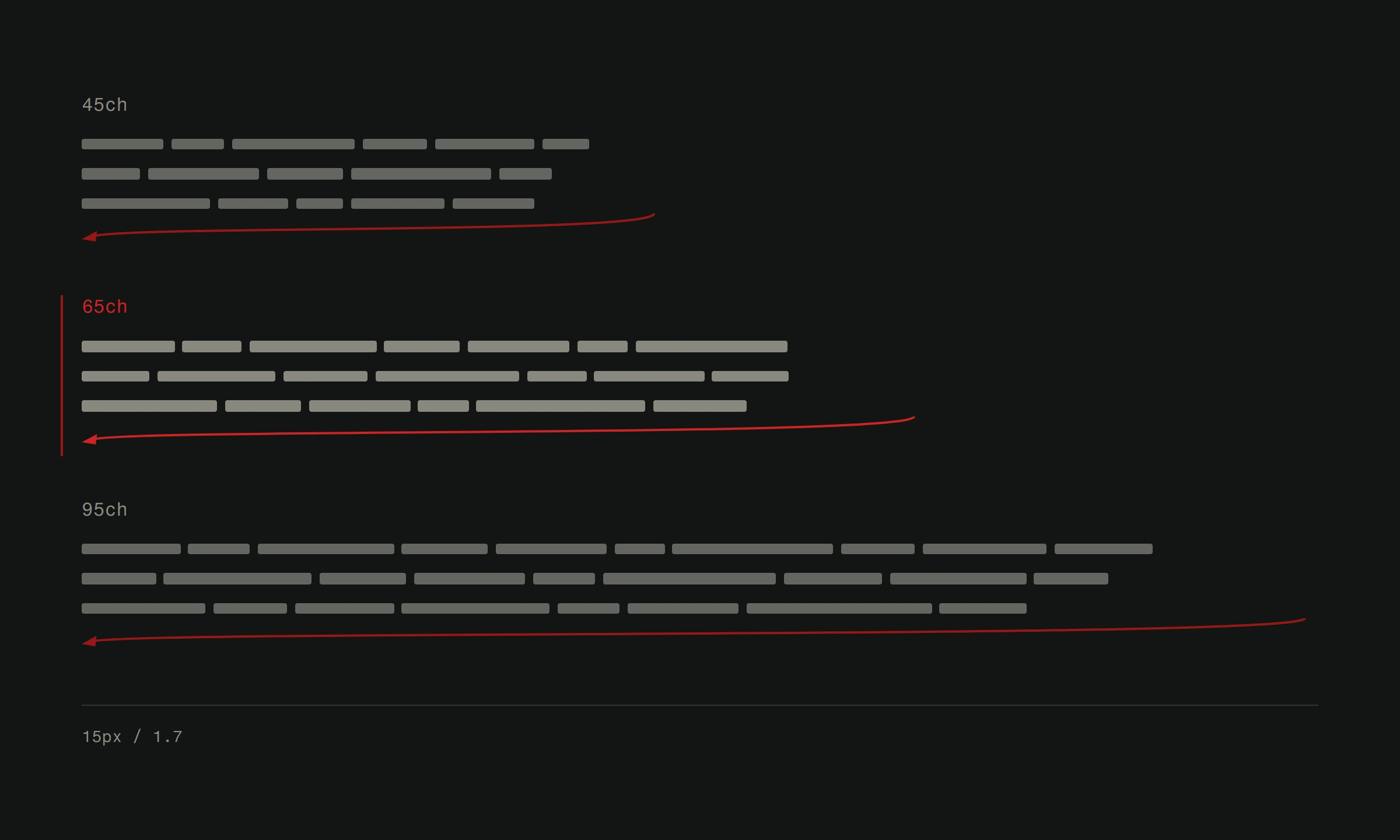
But differentiation is not the only reason typography matters. Readability directly affects how much of your content people actually consume. Line height, line length, font size, and contrast all determine whether someone reads your page or bounces.
A few things that hold up across every design trend cycle. Body text should be at least 16 pixels. Line height should be 1.4 to 1.6 times the font size. Lines should not exceed roughly 70 characters. These are not suggestions. They are readability fundamentals backed by decades of research.
Intentional animation
Animation on the web is a tool. Like any tool, it can be used well or poorly.
Good animation serves a purpose. It guides attention to an important element. It provides feedback after a user action. It smooths a transition between states so the interface feels responsive rather than jumpy.
Bad animation exists to impress other designers. Parallax scrolling on every section. Loading screens with elaborate animations for a page that should have loaded instantly. Hover effects that obscure the content you are trying to click.
The test is simple. Remove the animation. Does the user lose anything? If yes, the animation is doing work. If no, it is decoration. Decoration is fine in moderation. But it should never come at the cost of performance or usability.
Page load time is the most important animation. A site that appears instantly is more impressive than any scroll-triggered effect. Invest your performance budget wisely.
Responsive design is not optional
This should not need saying, but it does. Responsive design is not a feature. It is a baseline requirement.
More than half of all web traffic comes from mobile devices. In many markets, that number is over 70%. A website that does not work properly on a phone is a website that does not work for most of its audience.
Responsive design means more than shrinking the desktop layout. It means rethinking how content and navigation work on smaller screens. Touch targets need to be large enough. Text needs to be readable without zooming. Forms need to be usable with a thumb.
The best responsive designs start with mobile. Design for the smallest screen first, then add complexity for larger ones. This forces you to prioritize content and strip away anything unnecessary. Which brings us right back to minimalism.
Build for people, not for portfolios
The thread connecting all of these principles is the same. Design for the person using the site. Not for awards. Not for other designers. Not for your own portfolio.
A website that loads fast, reads well, works on every device, and makes it obvious what to do next will outperform a flashy, trend-chasing design every single time. Principles beat trends because principles are rooted in how humans work. Trends are rooted in what is currently popular.
Choose principles. They age better.
Need a website built on principles that last? Take a look at our web design approach or learn more about improving your site's UX.