Every year, the internet fills up with "web design trends" articles that read like wish lists. Half the stuff never takes off. The other half was already happening two years ago.
This is not that post. These are five shifts we're seeing in real client projects that genuinely change how websites perform. Not "cool ideas." Things that move the needle on conversions, engagement, and user satisfaction.
AI that actually personalizes (not just chatbots)
Everyone slapped a chatbot on their site in 2023 and called it "AI-powered." That's not what we're talking about.
Real AI personalization means your website changes what it shows based on who's looking at it. A returning visitor sees different content than a first-timer. Someone who browsed your pricing page twice gets a different homepage than someone who landed from a blog post.
This is not science fiction. It's happening now with tools that analyze behavior patterns and adjust content blocks in real time. The sites doing this well see measurable jumps in engagement. The sites still showing the same static page to everyone are leaving money on the table.
The catch? It takes thoughtful implementation. Bad personalization feels creepy. Good personalization feels like the site just "gets you." The difference is in the data you use and how subtle you are about it.
3D and interactive elements done right
Here's the thing about 3D on the web. For years, it meant slow load times, janky scrolling, and a site that made your laptop fan spin up like a helicopter.
That's changed. WebGL and modern frameworks now handle 3D elements without tanking site performance. Product configurators. Interactive data visualizations. Scroll-triggered animations that actually serve a purpose instead of just showing off.
The key word is "purpose." A 3D spinning logo adds nothing. A 3D product viewer that lets someone inspect your furniture from every angle before buying? That directly impacts sales.
We're building more of these for e-commerce clients, and the data backs it up. When people can interact with a product visually, they're more confident about purchasing. Fewer returns. Higher average order values.
Just don't go overboard. Every interactive element should earn its place by making the user's life easier, not by impressing other designers.
Dark mode is now table stakes
Dark mode used to be a nice extra. A toggle in the corner for people who prefer it. Now it's expected.
Operating systems default to it. Browsers support it natively. If your site doesn't respect the user's system preference, it feels broken. Like showing up to a meeting in a suit when everyone else is in t-shirts. You're technically fine, but you're out of sync.
The practical benefits are real. Less eye strain in low light. Lower battery consumption on OLED screens. And honestly, a lot of content just looks better on dark backgrounds. Photography pops. Typography gets more dramatic. White space becomes dark space, and it works.
Implementation is straightforward with CSS custom properties and prefers-color-scheme. The tricky part is designing for both modes from the start rather than bolting dark mode on later. Contrast ratios, image treatments, and shadow effects all need rethinking.
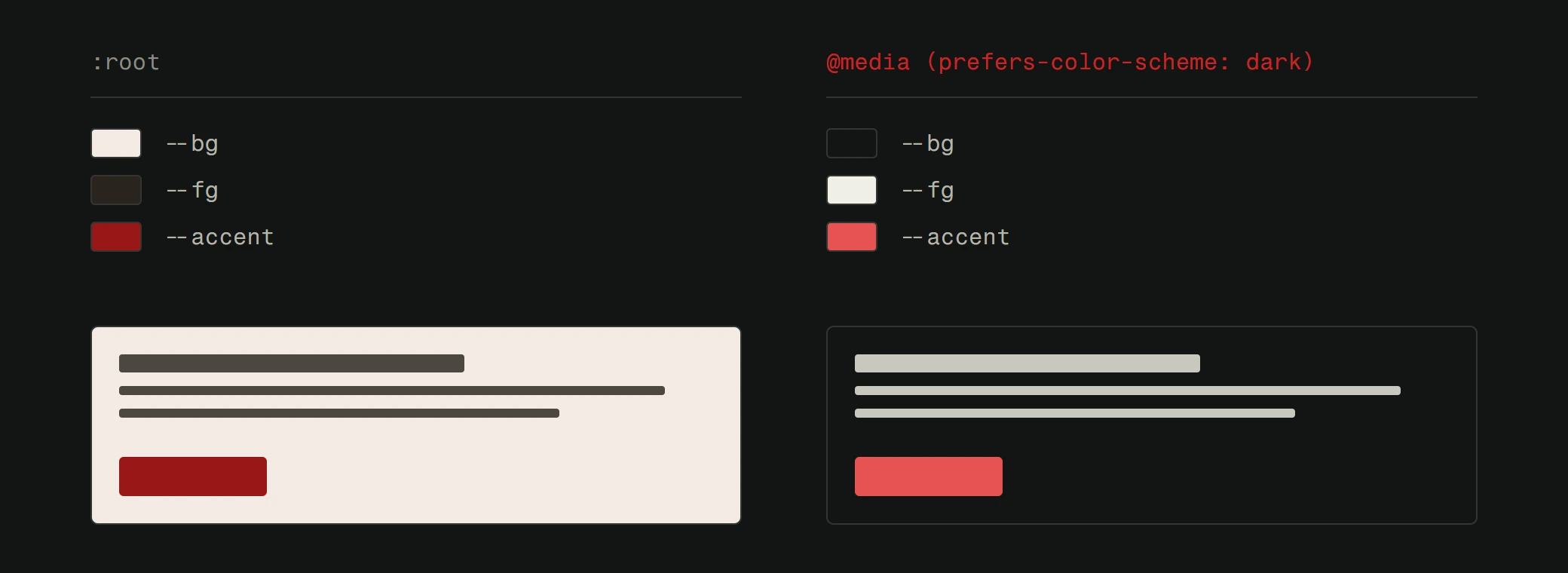
If you're building a new site, design dark mode first. It's easier to go dark-to-light than the reverse.
Minimalism that actually works (not just empty space)
Minimalism in web design has been a "trend" for a decade. But most minimal sites aren't minimal. They're just empty. Big hero image. Three words of text. Scroll down for more nothing.
Real minimalism means every element on the page earns its place. It means the user can find what they need in seconds, not minutes. It means fast load times because there's simply less to load.
The best minimal sites we've built share a few traits. Strong typography that does the heavy lifting. Generous spacing that guides the eye. Clear visual hierarchy so users know exactly where to look. And ruthless editing. If a section doesn't help the user accomplish their goal, it gets cut.
This directly ties into UX quality. A minimal site with bad UX is just a pretty site that doesn't convert. A minimal site with great UX is a machine.
Sustainable web design is getting serious
This one surprises people. Websites have a carbon footprint. Every page load transfers data, which takes server energy, which uses electricity. Globally, the internet's carbon emissions rival the airline industry.
Sustainable web design means building sites that are lighter, faster, and less wasteful. Optimized images. Efficient code. Green hosting. Fewer unnecessary scripts and trackers that bloat every page load.
The beautiful irony is that sustainable design is also better design. A lighter site loads faster. A site with fewer scripts is more secure. A site that doesn't track everything is more privacy-friendly. You're not sacrificing anything. You're improving everything.
We've started auditing client sites for carbon impact alongside performance. The fixes overlap almost completely. Compress images, remove dead code, optimize fonts, minimize third-party scripts. It's the same checklist for speed, SEO, and sustainability.
What this means for your site
Trends are only useful if you act on them. You don't need to adopt all five at once. Start with what's most relevant to your users.
If your bounce rate is high, look at personalization and UX minimalism. If your site feels dated, consider dark mode and interactive elements. If your loading speed is poor, sustainable design principles will fix that while future-proofing your site.
The common thread? All five trends point in the same direction. Faster, lighter, more intentional websites that respect users' time and preferences. That's not a trend. That's just good web design.
Building a site that actually follows through on these principles? That's what we do at Version2. No fluff, no filler. Just websites that work.