A website can look incredible in a Figma file and completely fall apart in a browser. Design mockups do not have loading times. They do not have slow connections, old phones, or screen readers. Real websites do.
The gap between a design that looks good and a design that works well comes down to technical foundations. These are the engineering decisions that determine whether your beautiful design actually delivers results.
Performance is a design decision
Every visual choice has a performance cost. That hero image. Those custom fonts. That scroll-triggered animation. Each one adds weight to your page and milliseconds to your load time.
This does not mean you cannot have nice things. It means you need to budget for them. Think of performance like a financial budget. You have a limited amount you can spend before the user experience suffers. Spend it on what matters most.
A fast website is not a bonus feature. It is the foundation everything else sits on. Google uses page speed as a ranking factor. Users abandon sites that take more than three seconds to load. Your conversion rate drops with every additional second of loading time.
Practical performance wins include lazy-loading images below the fold, using modern image formats like WebP or AVIF, minimizing JavaScript bundles, and serving assets from a CDN. None of these are glamorous. All of them make a measurable difference.
For a deeper look at optimizing your site's speed, we have a dedicated guide.
Mobile-first is engineering, not a buzzword
Designing mobile-first does not mean making the desktop version smaller. It means starting with the most constrained environment and building up from there.
When you design for a small screen with a slow connection and touch input first, you are forced to prioritize. What content is essential? What navigation structure works with a thumb? What interactions make sense without a mouse?
These constraints produce better designs. Not just for mobile, but for every screen size. The discipline of mobile-first thinking strips away the excess that desktop designs tend to accumulate.
From a technical standpoint, mobile-first means your CSS starts with the smallest breakpoint and progressively adds complexity for larger screens. It means testing on real devices, not just resizing your browser window. It means understanding that a phone on a cellular connection is a fundamentally different environment than a laptop on fiber.
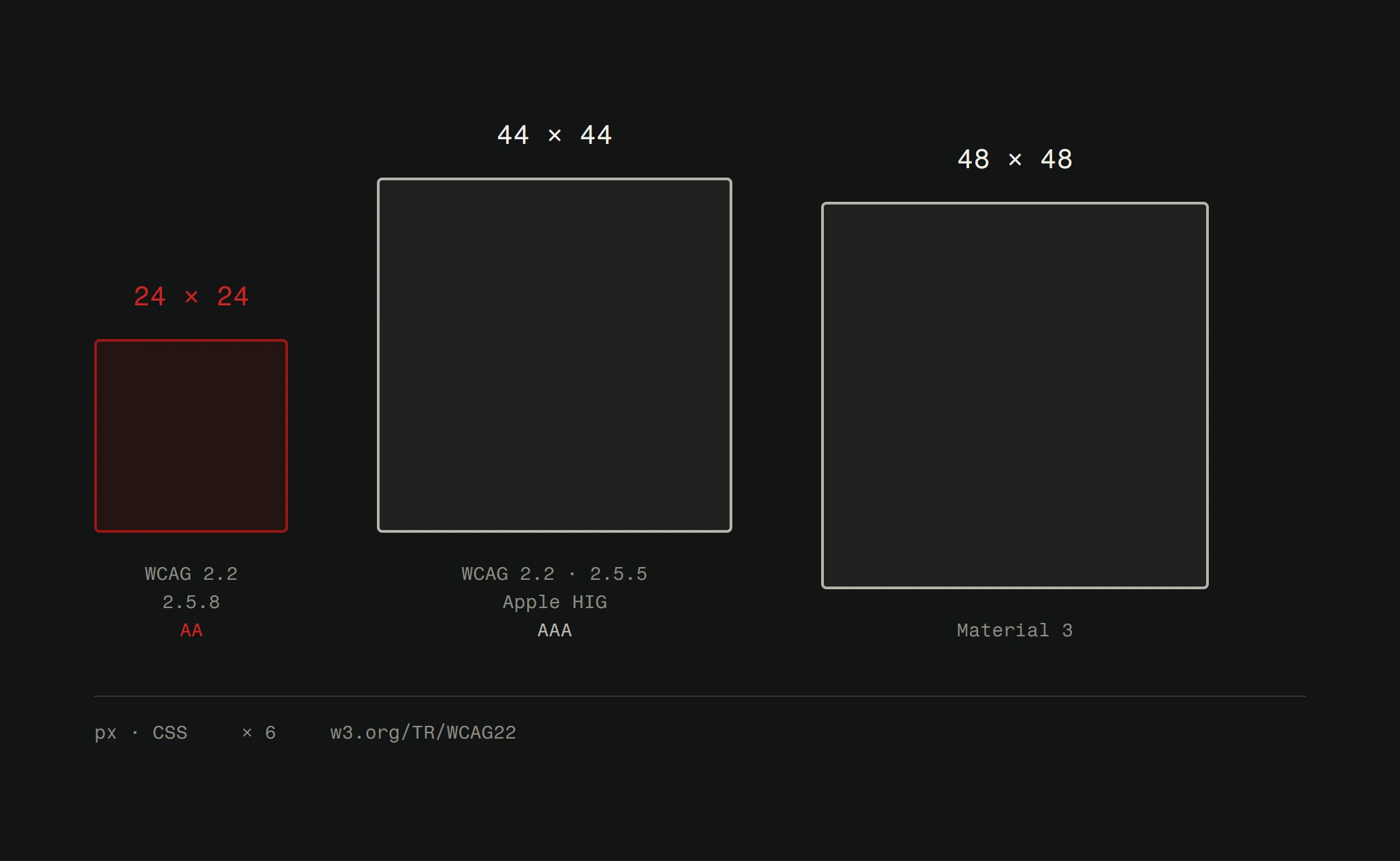
Touch targets should be at least 44 by 44 pixels. Forms should use appropriate input types so the right keyboard appears. Sticky headers should not eat up precious vertical space on small screens. These are not suggestions. They are requirements for a site that works.
Accessibility is not a checkbox
Accessibility gets treated like a compliance requirement. Something you check off at the end. A WCAG audit after the site is built. That approach produces bad results.
Accessible design means building for the full range of human ability from the start. Vision impairments. Motor disabilities. Cognitive differences. Temporary situations like a broken arm or bright sunlight washing out a screen.
The practical basics are straightforward. Use semantic HTML. Ensure sufficient color contrast. Make sure every interactive element is keyboard-accessible. Add alt text to images. Label form fields properly. These are not difficult to implement. They are difficult to retrofit.
Accessible sites tend to be better sites for everyone. Clear hierarchy, readable text, logical navigation, and sufficient contrast improve the experience for all users. Not just those with disabilities.
Test with a screen reader at least once during development. Tab through your entire site using only a keyboard. These two exercises reveal more usability problems than any visual review.
Structured content beats decoration
The information architecture of your site matters more than how it looks. A beautifully designed page that buries the answer to a user's question three scrolls down has failed.
Good content structure starts with understanding what your users want. What questions are they asking? What tasks are they trying to complete? Your page structure should map to these needs, not to your internal org chart.
Headers should create a scannable outline. Users do not read web pages linearly. They scan for relevant sections and dive in when something catches their attention. Your H2 and H3 structure should work as a table of contents.
White space is not wasted space. It creates breathing room that makes content digestible. Dense walls of text drive people away. Short paragraphs, clear headings, and generous spacing keep people reading.
This principle extends to user experience design as a whole. Every page should have one primary purpose and one clear action you want the user to take. If you cannot articulate what a page is for in one sentence, the page needs rethinking.
Progressive enhancement still matters
Not every user has the latest browser, the fastest connection, or JavaScript enabled. Progressive enhancement means your site works for everyone and gets better for those with modern capabilities.
The core content and functionality should work with HTML alone. CSS adds the visual layer. JavaScript adds interactivity on top. If any layer fails, the layers below still work.
This is not an academic concern. JavaScript fails more often than developers think. Firewalls block scripts. Extensions interfere with page behavior. Mobile connections drop packets. A site built with progressive enhancement degrades gracefully. A site that depends entirely on client-side JavaScript breaks completely.
Server-side rendering, static generation, and hybrid approaches all support this philosophy. The specific technology matters less than the principle. Build the foundation solid. Add the fancy stuff on top.
Measure what matters
The difference between a good-looking website and an effective one is data. Pretty is subjective. Performance is measurable.
Core Web Vitals give you concrete metrics. Largest Contentful Paint measures loading performance. Interaction to Next Paint measures interactivity. Cumulative Layout Shift measures visual stability. These are not just Google's preferences. They are direct proxies for user experience.
Beyond performance, track how people actually use your site. Where do they click? Where do they drop off? Which pages have high bounce rates? This data should drive design decisions more than trends or personal taste.
A/B testing is underused. When you are debating between two design approaches, test them. Let actual user behavior settle the argument. The version that produces better results wins, regardless of which one the design team preferred.
The invisible foundation
The best technical foundations are invisible. Users do not notice a fast site. They notice a slow one. They do not appreciate accessible design. They get frustrated by inaccessible design. They do not admire good content structure. They struggle with bad structure.
This is the nature of foundational work. It does not get applause. It prevents failure. And in web design, preventing failure is worth more than any visual flourish.
Build the foundation right. Then make it beautiful.
Want a website built on solid technical foundations? Explore our web design services or request a free website analysis to see where your current site stands.