Your logo is probably the first thing anyone sees when they encounter your brand. On your website. On your invoice. On your Google listing. It shows up everywhere, and it either makes people take you seriously or makes them scroll past.
A good logo is not about being flashy or trendy. It is about being clear, memorable, and functional. The logos that last decades tend to be the simplest ones. Think about the brands you recognize instantly. Their logos are not complicated.
Before you design anything
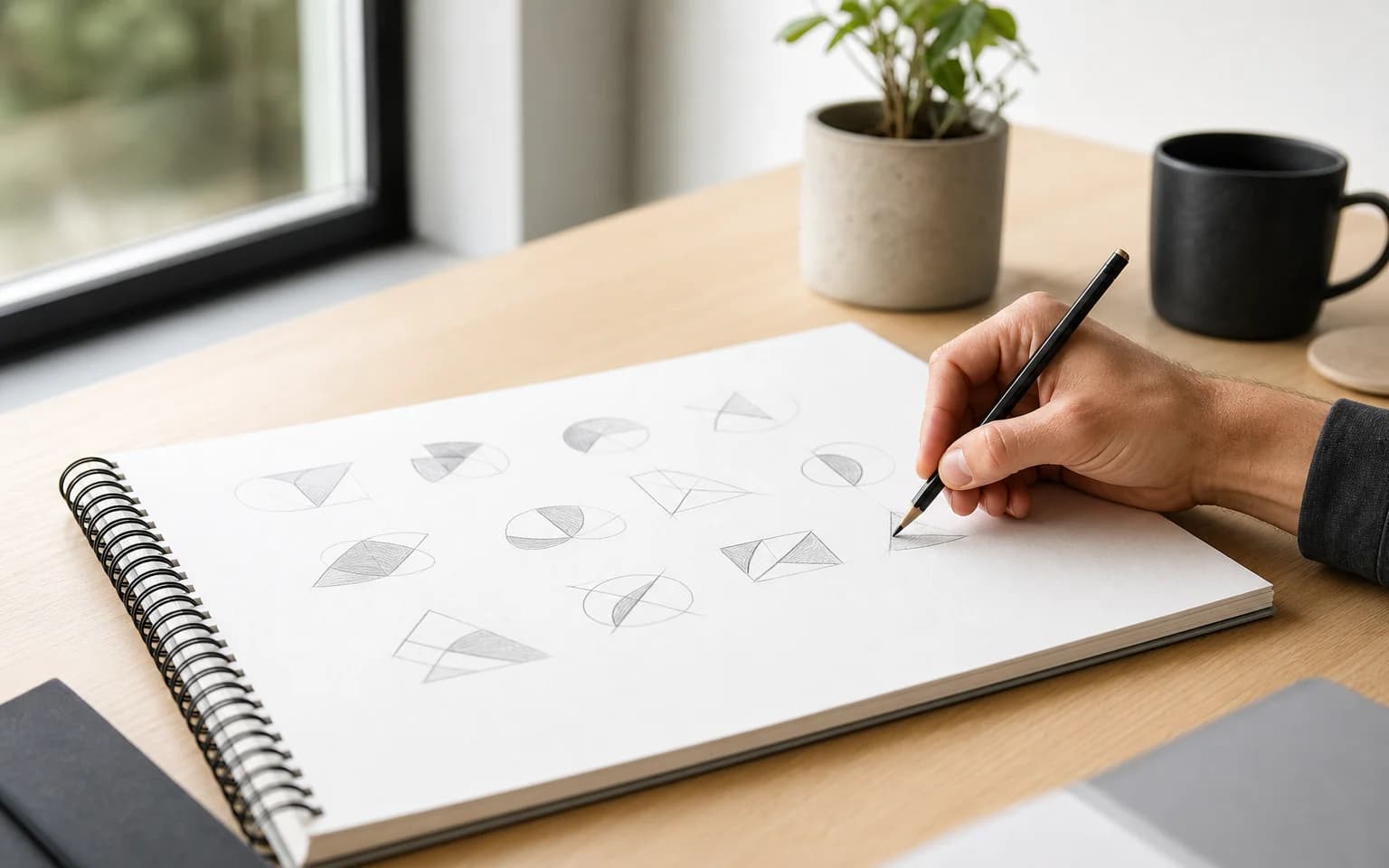
Most people start logo design by opening a design tool and playing with shapes. That is backwards.
A great logo comes from understanding what it needs to represent. Before you sketch a single line, get clear on these things:
Your brand identity. What does your business stand for? What is your personality? A logo for an accounting firm and a logo for a skate shop should feel completely different. If you have not sorted out your overall branding strategy, start there.
Your audience. Who needs to respond to this logo? A 25-year-old designer and a 55-year-old business executive have very different visual preferences. Your logo does not need to appeal to everyone. It needs to appeal to your people.
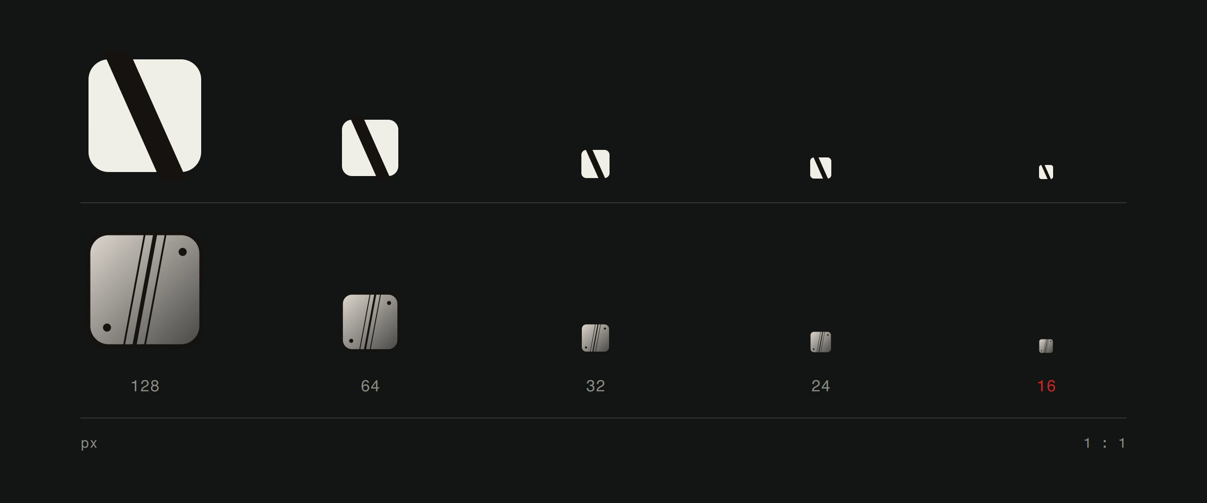
Where it will live. This is the part most people forget. Your logo needs to work on a website favicon (16x16 pixels), on a business card, on a billboard, and everywhere in between. It needs to work in color, in black and white, and on different backgrounds. Design for the hardest use case first.
The principles that separate good logos from bad ones
Logo design has rules. You can break them later if you know what you are doing, but start by understanding them.
Simplicity wins every time
The most effective logos are dead simple. One shape. One idea. No gradients, no drop shadows, no tiny details that disappear at small sizes.
Complexity is the enemy of recognition. When someone sees your logo for half a second on a browser tab or a mobile screen, they need to register it instantly. That only happens with simple designs.
Make it memorable
A simple logo is not automatically memorable. It also needs a distinctive quality. Something that makes your brain file it away differently from every other logo it has seen today.
That might be a clever use of negative space. An unexpected shape. A unique relationship between the symbol and the text. The goal is for someone to see your logo once and be able to roughly sketch it from memory.
Design for longevity, not trends
Design trends come and go. Gradients were out, then they were in, now they are shifting again. If your logo chases the current trend, it will look dated in three years.
The best logos are timeless because they rely on fundamental design principles rather than whatever is popular on Dribbble this month. Design something that will still feel right a decade from now.
Choosing colors with purpose
Color is not just about aesthetics. Colors trigger emotional responses, and those responses either support your brand or work against it.
A few principles to guide your choices:
Start in black and white. If your logo does not work without color, it does not work. Design the shape first, then add color as a layer on top.
Limit your palette. One or two colors is enough. Every additional color adds complexity and makes reproduction harder. Think about what happens when someone faxes your invoice or prints it on cheap paper.
Understand color psychology. Blue suggests trust and professionalism. Red signals energy and urgency. Green implies growth and health. Yellow conveys warmth and optimism. These are not absolute rules, but they are real patterns in how people perceive brands. We have a full breakdown of how colors affect website user experience if you want to go deeper.
Typography in logo design
If your logo includes text (and most do), the typeface choice is critical. The font carries just as much personality as the symbol.
Match the font to the brand. A serif font says established and traditional. A geometric sans-serif says modern and clean. A hand-lettered style says personal and creative. Pick the one that fits your brand voice.
Prioritize legibility. If people cannot read your company name in the logo, the logo has failed at its primary job. Test it at small sizes. If the text gets mushy below a certain point, you need a different approach.
Consider custom lettering. Off-the-shelf fonts work, but custom typography gives you something no one else has. Even small modifications to an existing typeface can make your wordmark feel unique. For more on working with type, check out how to choose the right font.
Your logo on the web
Here is where a lot of logo guides stop, but for us it is where things get interesting. Your logo will spend most of its life on screens. That means web performance matters.
Use SVG format. Scalable Vector Graphics look crisp at any resolution, from a phone screen to a 4K monitor. They also have tiny file sizes compared to PNGs.
Optimize for loading speed. Your logo is probably in the header, which means it loads on every single page. A bloated logo file slows down your entire site. Keep it lean. For more on why speed matters, see our site speed optimization guide.
Test responsiveness. Your logo might need a simplified version for mobile navigation. Many brands have a full logo and a compact icon version. Plan for both from the start.
Think about dark mode. If your logo only works on white backgrounds, you have a problem. More and more websites and apps support dark mode. Your logo should work in both contexts.
Common mistakes to avoid
Following trends blindly. What looks cool today will look dated tomorrow. Design for your brand, not for Instagram likes.
Designing by committee. Too many opinions produce a logo that pleases no one. Trust the process and the people doing the work.
Using clip art or templates. If your logo came from a free logo generator, it is not unique. Someone else has the same one. That defeats the entire purpose.
Skipping the testing phase. A logo that looks great on your laptop screen might fall apart on a business card. Test every context before finalizing.
When to get professional help
Canva and AI tools have made it easy to create something that looks like a logo. But looking like a logo and being a logo that works are different things.
A professional designer thinks about scalability, brand alignment, cultural context, and technical requirements that most people never consider. If your brand matters to you, the logo is worth doing right. A complete brand identity built from scratch, where the logo, business cards, and website all speak the same visual language, is what makes the whole thing work.
Building a brand that starts with a great website? Take a look at our web design process and see how it all comes together.