Most web design advice boils down to "make it look nice." Thanks. Very helpful.
The problem with generic advice is that it doesn't change behavior. You read "use good typography" and nod, but nothing on your site gets better. So let's skip the vague stuff. Here are specific, actionable changes that actually improve how websites perform.
1. Kill the clutter
Every element on your page should earn its place. That decorative sidebar widget nobody clicks? Remove it. The three different banner styles competing for attention on your homepage? Pick one.
Visual clutter creates cognitive load. When visitors have to process too much at once, they process nothing. They leave.
The test is simple. Look at each element on your page and ask: "If I removed this, would anyone notice?" If the answer is no, it shouldn't be there.
White space isn't wasted space. It's breathing room that makes your actual content stand out.
2. Make your typography do the heavy lifting
Typography isn't about picking a cool font. It's about creating a clear visual hierarchy that tells people what to read first, second, and third.
Use two fonts maximum. One for headings, one for body text. Set your body text to at least 16px. Anything smaller and mobile users will be squinting. Keep line lengths between 50-75 characters per line. Longer lines are harder to track back to the start.
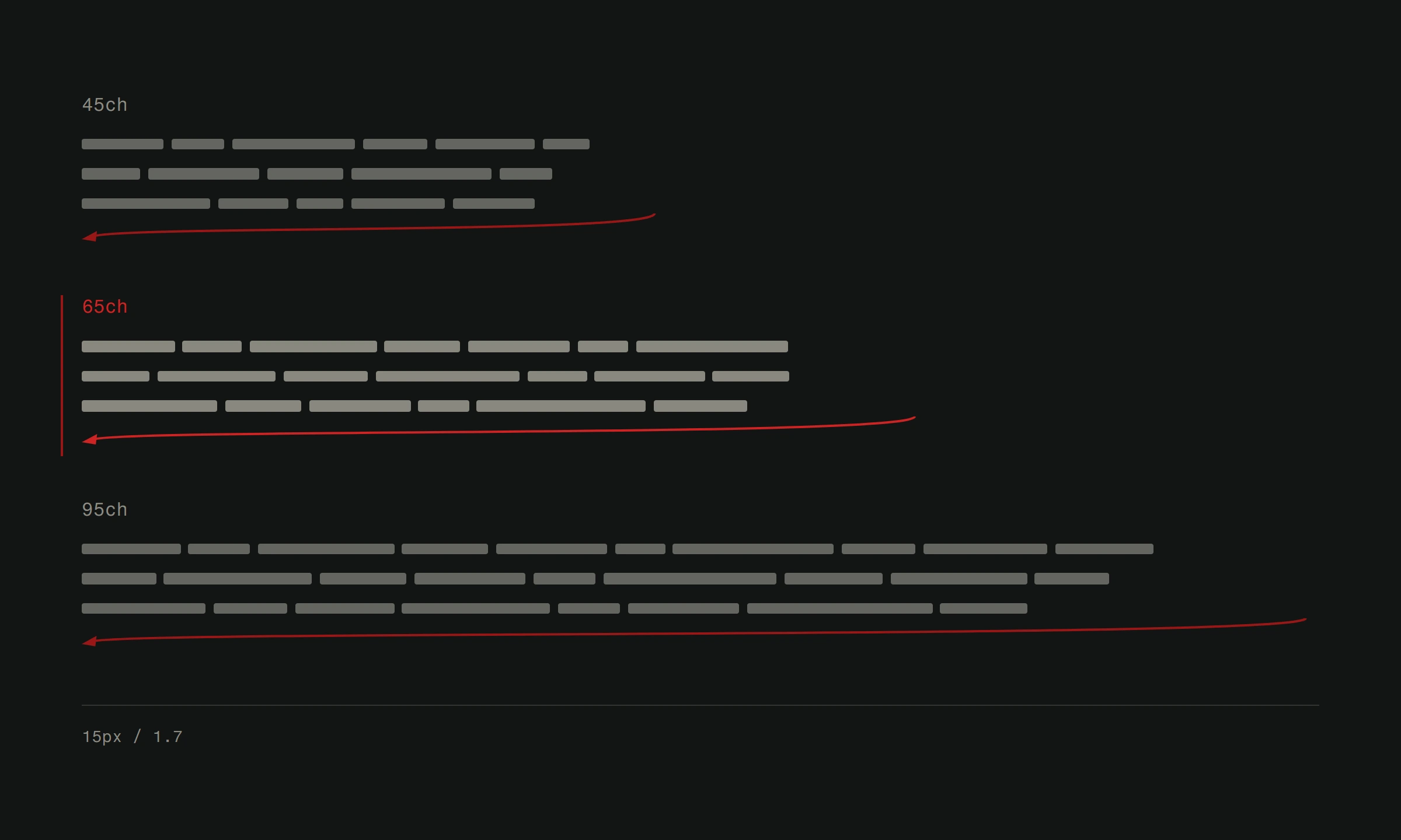
Line height matters more than most people think. Set it to 1.5-1.7 for body text. Cramped text feels stressful to read, even if readers can't articulate why.
3. Choose colors with intent
Color isn't decoration. It's communication. Your color palette influences how people feel about your brand before they read a single word.
Limit your palette to 3-4 colors. One primary, one secondary, one accent, and one neutral. Use the accent color sparingly for the things you want people to notice: call-to-action buttons, important links, key notifications.
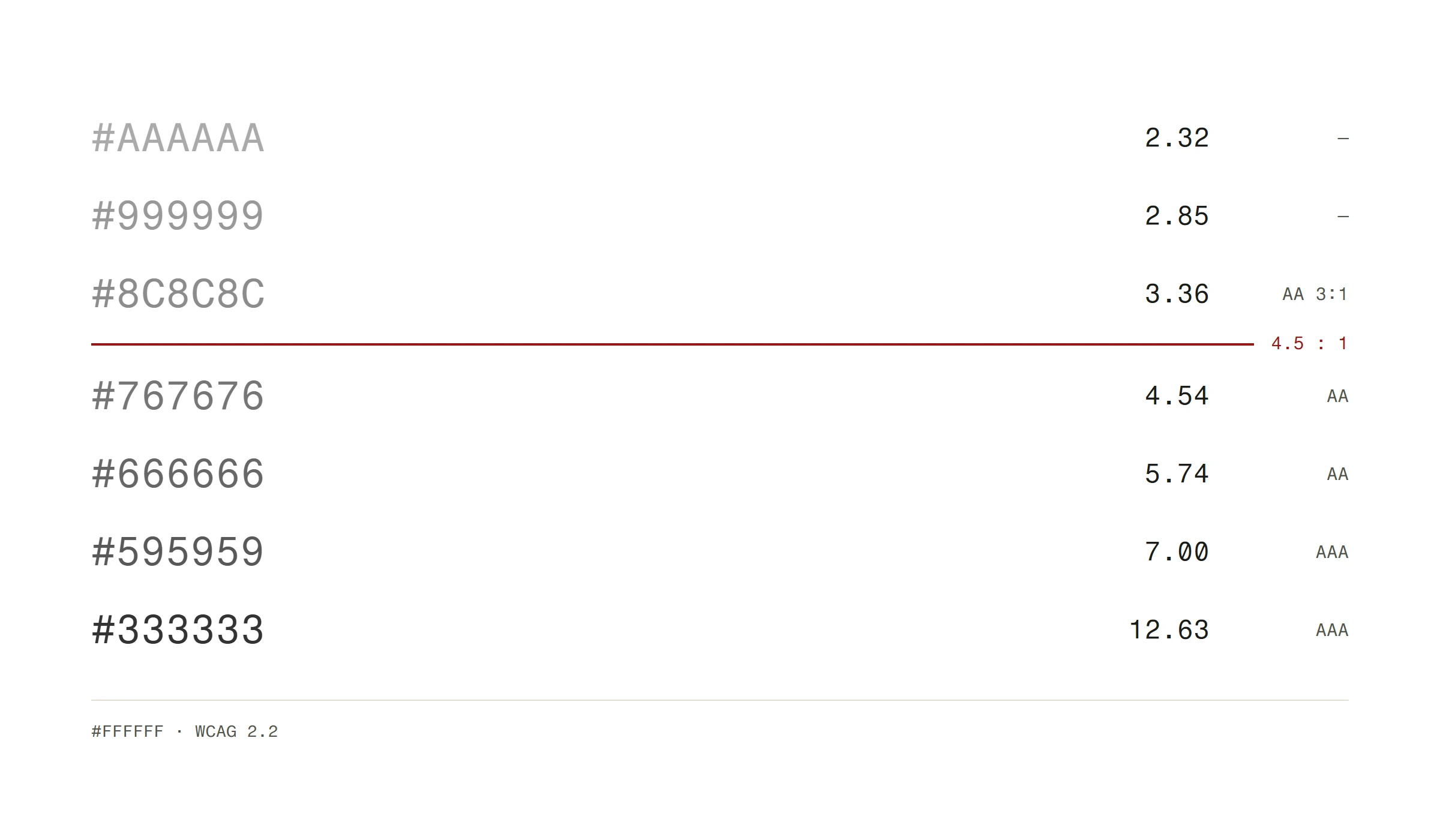
Check your contrast ratios. Light gray text on a white background might look sophisticated in a mockup, but it's unreadable in a sunny room. WCAG AA standards require a minimum contrast ratio of 4.5:1 for normal text. Meet it.
4. Speed up your load time
A slow website isn't a minor inconvenience. It's a conversion killer. Research consistently shows that every additional second of load time increases bounce rate significantly. After 3 seconds, you've lost a huge chunk of your visitors.
The usual culprits: uncompressed images, too many fonts loaded, excessive JavaScript, no browser caching. Fix these and you'll see results immediately.
Compress every image. Use modern formats like WebP. Lazy-load images below the fold. Minimize CSS and JavaScript. These aren't optional optimizations. They're baseline requirements. Read our detailed guide on optimizing website speed for the full checklist.
5. Design for mobile first
Over 60% of web traffic is mobile. If your site isn't built for phones first, you're designing for the minority.
Responsive design means more than shrinking a desktop layout. It means rethinking what content matters on a small screen. It means making tap targets large enough for thumbs. It means ensuring forms are usable on a phone keyboard.
Test your site on an actual phone. Not a browser resize. A real phone, in your hand, outdoors in the sun. That's the real-world condition most of your visitors are experiencing.
6. Make navigation obvious
If people can't find what they're looking for in 3 seconds, they'll leave and try your competitor instead.
Keep your main navigation to 5-7 items. Label them with plain language, not marketing speak. "Services" beats "What We Do For You." "Pricing" beats "Investment Options."
Put the most important items first. People scan from left to right (in LTR languages), and mobile menus are read top to bottom. The first item gets the most attention.
Every page should answer two questions instantly: "Where am I?" and "What can I do next?" If those answers require detective work, your navigation needs fixing.
7. Use real images, not stock photos
Stock photos of people shaking hands in front of glass buildings communicate exactly one thing: "We couldn't be bothered to take real photos."
Real photography of your team, your work, your office, your products builds trust that stock images never will. People buy from people. Showing actual humans behind the business makes your site more credible.
If professional photography isn't in the budget yet, use simple, honest images. A phone photo of your actual workspace beats a $5 stock photo of a fake one.
8. Write CTAs that tell people what happens next
"Submit" is not a call to action. It's a command. "Learn more" is barely better. These labels tell people nothing about what happens when they click.
Good CTAs are specific. "Get your free quote" tells the user exactly what they'll receive. "Start your 14-day trial" sets clear expectations. "Download the pricing guide" promises a specific deliverable.
The button text should complete the sentence: "I want to ___." If that sentence sounds natural, your CTA works.
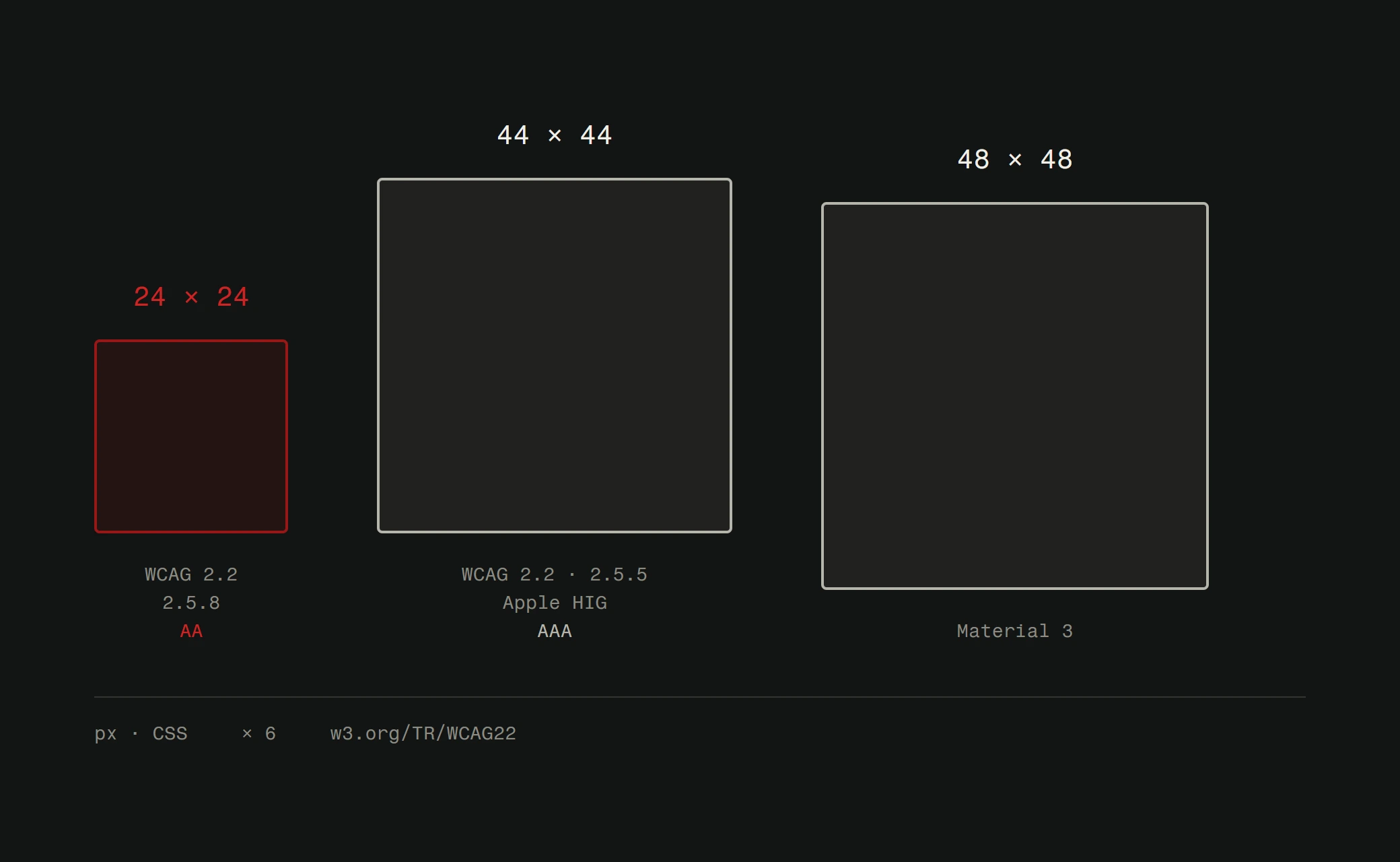
Also: make buttons look like buttons. Sufficient size, clear contrast against the background, and enough padding that they don't feel cramped. On mobile, buttons need to be at least 44x44 pixels for comfortable tapping.
9. Test with real people
Your opinion about your website doesn't matter. Your designer's opinion doesn't matter. What matters is whether actual users can accomplish their goals on your site.
Run simple usability tests. Give someone a task ("Find the pricing for our premium plan") and watch them try. Don't help. Don't explain. Just observe. You'll learn more in 15 minutes of watching a real person use your site than in hours of internal debate.
A/B testing works for smaller decisions. Should the button be green or blue? Should the headline emphasize price or quality? Don't guess. Test it, measure it, go with the data.
Use tools like Google Analytics to track what's actually happening. High bounce rate on a specific page? Something's wrong with that page. Low conversion on your contact form? The form needs work. Let the numbers guide your UX improvements.
The underlying principle
Every tip above traces back to one idea: respect your visitors' time and attention. They came to your site for a reason. Good design helps them accomplish that reason with minimum friction.
That doesn't mean boring. It doesn't mean minimal for the sake of minimal. It means every design choice serves the person using the site, not the ego of whoever designed it.
The best websites feel effortless to use. Getting there takes deliberate, focused effort.
Want a professional assessment of your current site? We offer a free website analysis that identifies exactly what's working, what's not, and what to fix first.