You have about 50 milliseconds to make a first impression with your website. And typography is doing more of that heavy lifting than most people realize.
The wrong font makes a professional business look amateur. The right font makes a small startup look established. That is how much power a typeface carries. Choosing a font is not a cosmetic decision. It is a design decision that affects readability, brand perception, and even how fast your website loads.
Understanding the main font categories
Before you start browsing Google Fonts, you need to know what you are looking at. Every typeface falls into a handful of categories, and each one communicates something different.
Serif fonts
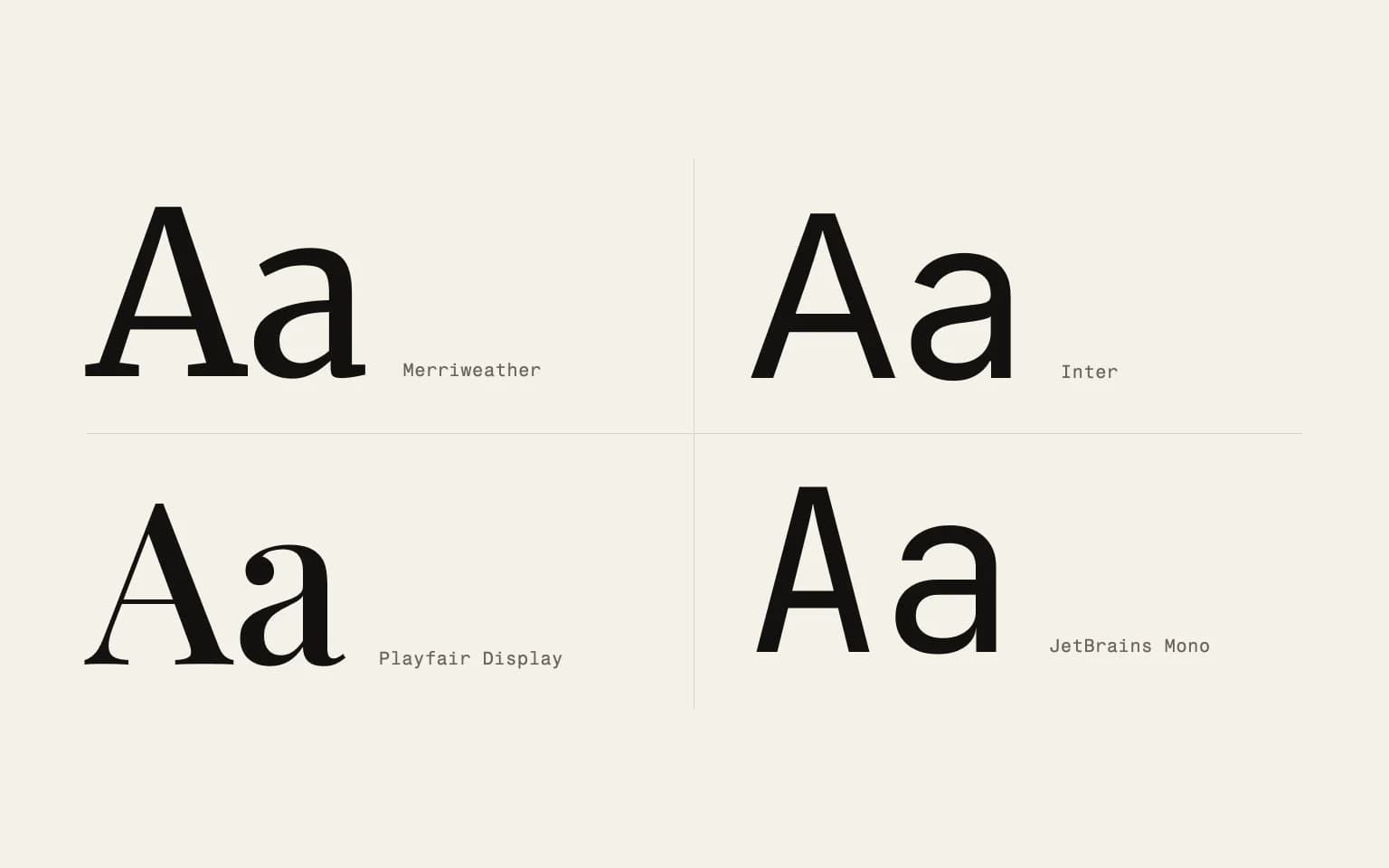
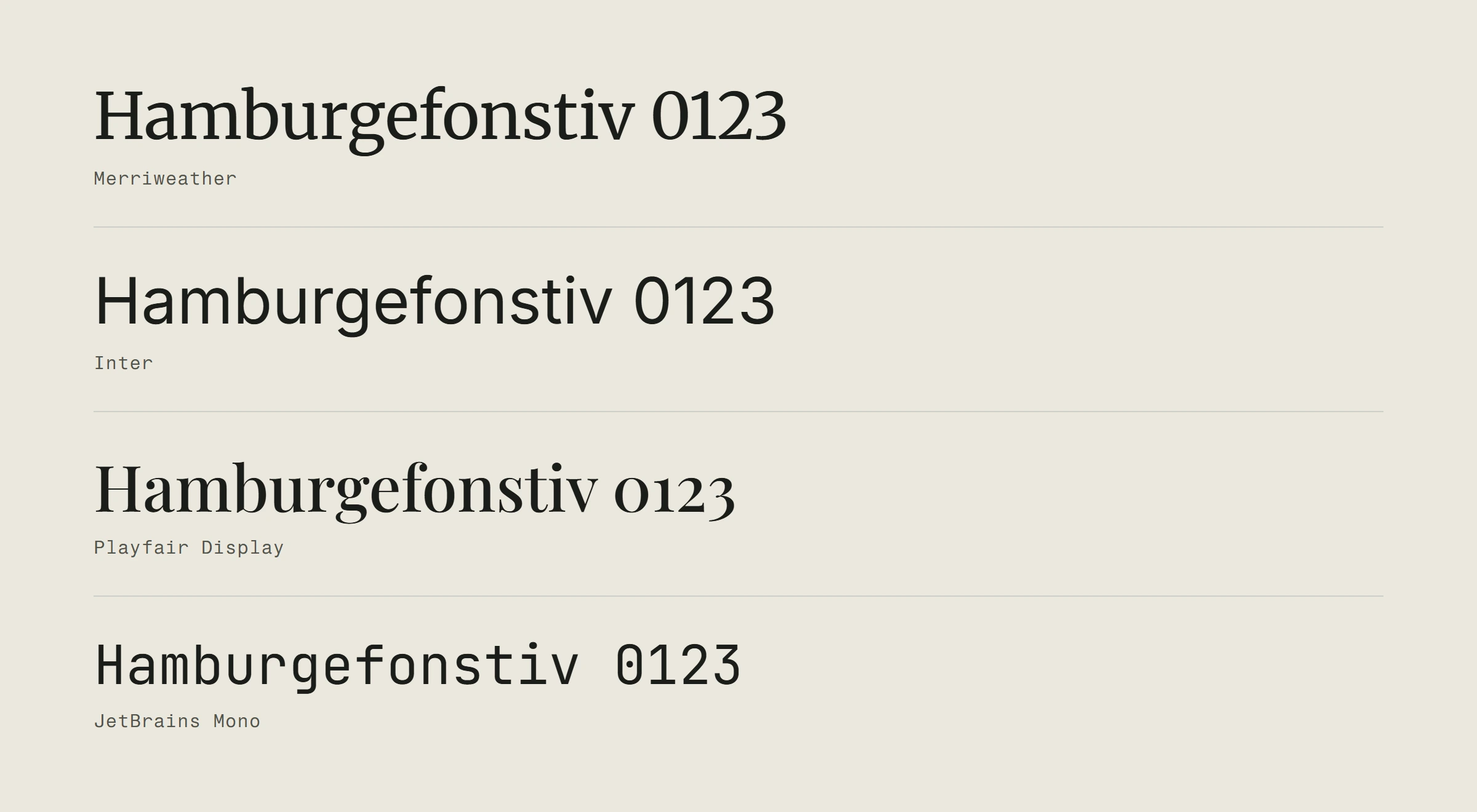
These are the ones with small strokes (serifs) at the ends of letters. Think Georgia, Merriweather, or Playfair Display. Serifs feel traditional, established, and trustworthy. They work well for long-form reading and brands that want to project authority.
On the web, serifs used to have a readability problem on low-resolution screens. That is mostly gone now with high-DPI displays, but it is still worth testing at smaller sizes.
Sans-serif fonts
No strokes at the ends. Clean, modern, minimal. Inter, Open Sans, Roboto. This is the default choice for most websites, and for good reason. Sans-serif fonts are highly legible on screens of all sizes and resolutions.
If you are not sure where to start, a well-chosen sans-serif is a safe and effective choice for body text.
Display and decorative fonts
These are the personality fonts. Bold, expressive, sometimes quirky. They work beautifully for headlines, hero sections, and short text that needs to grab attention. They are terrible for body copy. Nobody wants to read a full paragraph in a decorative typeface.
Use these sparingly and intentionally. One display font for headlines paired with a clean body font is a solid pattern.
Monospace fonts
Every character takes up the same width. These are traditionally used for code, but some brands use them for a technical or editorial aesthetic. Fira Code, JetBrains Mono, IBM Plex Mono. They give your site a distinctive feel but can reduce reading speed for long text blocks.
What makes a font work on the web
Choosing a font for a website is different from choosing one for a print brochure. Screens have their own rules.
Readability at every size
Your body text needs to be crystal clear at 16px. Your navigation needs to work at 14px. Your headings need to look sharp at 48px. Not every font handles this range well. Test your candidates at multiple sizes before committing.
Pay attention to x-height (the height of lowercase letters). Fonts with a larger x-height tend to be more readable on screens. That is why fonts like Inter and Source Sans perform so well for web content.
Performance matters more than you think
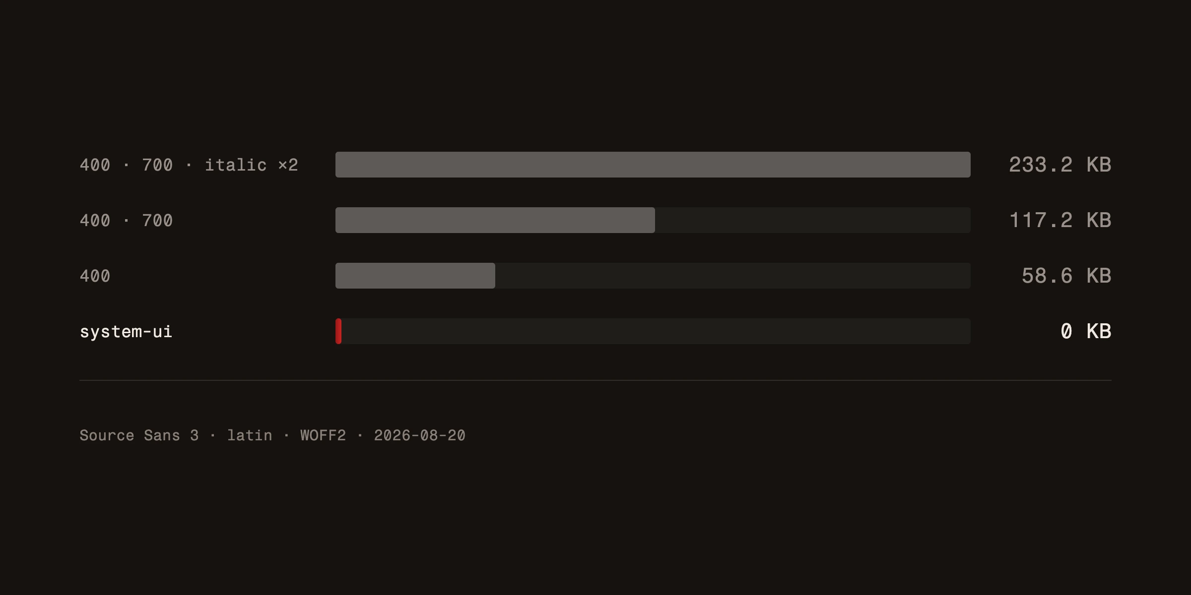
Every font you add to your website is a file that needs to download before text can render. A single font family with regular, bold, italic, and bold-italic weights can easily add 200-400KB to your page load.
That matters. Google uses page speed as a ranking factor. Visitors on slow connections see a flash of invisible or unstyled text. Here is how to keep fonts fast:
Limit your weights. Do you really need light, regular, medium, semibold, bold, and black? Most sites work perfectly with two or three weights.
Use modern formats. WOFF2 is the current standard. It is significantly smaller than TTF or OTF files. If your font provider still serves older formats, switch.
Consider system font stacks. For body text, a stack like system-ui, -apple-system, sans-serif renders instantly because it uses fonts already on the user's device. No download at all. It does not give you the same brand control, but it gives you perfect performance.
Preload critical fonts. If you are using custom web fonts, use <link rel="preload"> to tell the browser to fetch them early. This reduces the delay before text appears.
Pairing fonts without making a mess
Most websites need two fonts. One for headings, one for body text. Maybe a third for accents or UI elements if you are building something complex. More than three is almost always too many.
The classic pairing strategy: contrast. A serif heading with a sans-serif body. A bold display font with a neutral body font. The heading grabs attention, the body font stays out of the way and lets people read.
A few pairing principles that work:
Contrast, not conflict. The two fonts should feel different but not like they are from different planets. They should share a similar mood even if their structures differ.
One font does the talking. Your heading font is the expressive one. Your body font is the workhorse. Do not make both fonts compete for attention.
Test with real content. Do not judge a pairing with "Lorem ipsum." Put your actual headlines and paragraphs in there. Some combinations look great in a font picker and terrible with real words.
If you want to explore specific recommendations, our post on the latest free fonts you should try is a good starting point.
Typography and brand identity
Your font choices are a direct expression of your brand. A law firm using Comic Sans would be absurd. A children's toy store using a formal serif would feel cold. The typeface needs to match the personality.
Think about what your brand voice sounds like. Is it friendly and casual? Look at rounded sans-serifs. Is it sophisticated and premium? Consider a clean serif. Is it technical and precise? A geometric sans-serif or monospace might work.
Whatever you choose, consistency matters. Use the same fonts across your website, your marketing materials, and your business documents. Typography is one of the most visible parts of your overall brand identity, and inconsistency breaks trust fast.
Mistakes that make designers cringe
Using too many fonts. Two is ideal. Three is the max. Five is chaos.
Ignoring line height and spacing. Even a great font looks bad with cramped line height. Body text generally needs 1.5 to 1.7 line height for comfortable reading.
Choosing style over function. That ultra-thin fashion font looks gorgeous in a Behance mockup. It is unreadable at body text sizes on a real website. This is a common pitfall when building a visual identity that stands out on the web: distinctiveness should never come at the cost of legibility.
Forgetting about accessibility. Low contrast text is a real problem. Light gray on white might look sleek, but people with visual impairments cannot read it. Check your contrast ratios.
Skipping font licensing. Not every free font is free for commercial use. Check the license before you ship.
Making the final decision
After all this analysis, here is the practical path: start with your body font. Pick something highly readable, available in the weights you need, with good web performance. Build the rest of your typography around that foundation.
Test it live. Not in a design tool. On an actual webpage, on a phone, on a slow connection. That is where the truth lives.
Good typography is invisible. Readers should never think about the font. They should just feel like the text is easy and pleasant to read. When that happens, you have chosen well. Typography is one of the modern web design principles that ages well regardless of which trends come and go.
Building a website where every detail matters? See how we handle web design from typography to deployment.