Nobody leaves your website thinking "the user experience was subpar." They just leave. They click away, they bounce, they go to your competitor. And your analytics show a line going in the wrong direction without telling you why.
That's the tricky thing about UX. When it's good, nobody notices. When it's bad, nobody tells you. They just disappear.
What UX actually means (not the buzzword version)
User experience is not about making things pretty. It's about removing friction between your visitor and whatever they came to do.
Someone lands on your site looking for your phone number. Can they find it in under 5 seconds? That's UX. Someone wants to buy a product. How many clicks between "I want this" and "done"? That's UX. Someone is reading your services page on a phone while riding a bus. Can they actually read it? That's UX too.
Every unnecessary click, every confusing label, every slow-loading page is a small tax you charge your visitors. Charge enough taxes and they leave.
The 3-second rule
Visitors form their first impression of your site in about 3 seconds. In that window, they answer three unconscious questions.
"Am I in the right place?" Your headline, hero image, and overall layout need to instantly confirm that yes, this is what they were looking for.
"Does this look trustworthy?" Clean design, consistent branding, professional imagery. Outdated design signals an outdated business. Fair or not, that's how people think.
"What should I do next?" If the visitor has to figure out where to go, you've already lost some of them. The path forward should be obvious without thinking about it.
Fail any of these three and your bounce rate climbs.
Navigation: The skeleton of your site
Navigation is the most underrated UX element. It's also the one most sites get wrong.
Keep it simple. Seven main navigation items is the practical limit. More than that and you're forcing visitors to scan and decide instead of clicking and moving. Dropdown menus should be one level deep. Mega menus with three nested levels are a maze, not a menu.
Use words people actually use. "Our Offerings" instead of "Services." "Knowledge Hub" instead of "Blog." Clever labels aren't clever when visitors can't find what they need. Use the most obvious, boring, descriptive word for each navigation item.
Make the current location obvious. Visitors should always know where they are in your site's structure. Active navigation states, breadcrumbs, clear page titles. Getting lost on a website is the fastest way to leave it.
Put the important stuff first. Eye-tracking studies consistently show that the first and last items in a navigation bar get the most attention. Put your money pages there.
Speed is a UX feature
A page that takes 4 seconds to load has already failed at UX. It doesn't matter how beautiful it is when it finally appears.
Every second of load time increases bounce rates significantly. After 3 seconds, over half your visitors are gone. They didn't see your beautiful hero section. They didn't read your compelling copy. They saw a loading spinner and hit the back button.
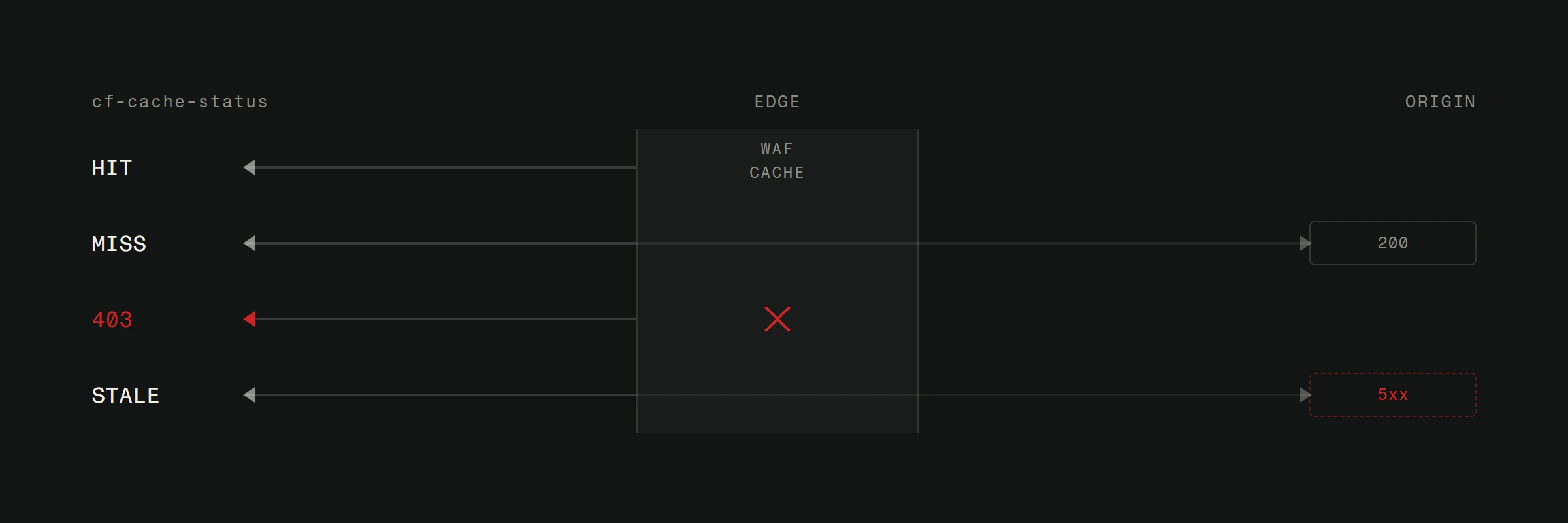
Optimizing site speed is the single highest-impact UX improvement most sites can make. Compress images. Minimize JavaScript. Use a CDN. Set up Cloudflare. These aren't fancy upgrades. They're basic hygiene.
Run your site through Google PageSpeed Insights right now. If your mobile score is below 70, that's where you start fixing things. Not with a redesign. With performance.
Mobile UX is not desktop UX made smaller
Over 60% of web traffic comes from phones. Yet most sites are still designed on a desktop and then awkwardly squeezed onto smaller screens.
Mobile-first design means rethinking your content for thumbs, not mice. Here's what that looks like in practice.
Touch targets need to be at least 44x44 pixels. That's Apple's guideline and it exists because human fingers aren't precision instruments. Tiny links stacked next to each other are a frustration machine.
Horizontal scrolling is a crime. If any element on your page causes horizontal scrolling on mobile, fix it immediately. Tables, images, embedded content. All of it needs to fit the viewport.
Forms need to be minimal. Every field you add to a mobile form loses you submissions. Ask for the absolute minimum. Name, email, message. That's it for a contact form. You can ask for more later.
Test on actual devices. Browser dev tools are useful for quick checks. But nothing replaces holding a phone in your hand and trying to use the site. You'll find problems in 30 seconds that you'd miss forever in a simulator.
Content hierarchy: Guide the eye
Your visitors don't read your website. They scan it. Eye-tracking research shows an F-pattern: across the top, down the left side, with occasional horizontal sweeps through the content.
Design for scanning, not reading.
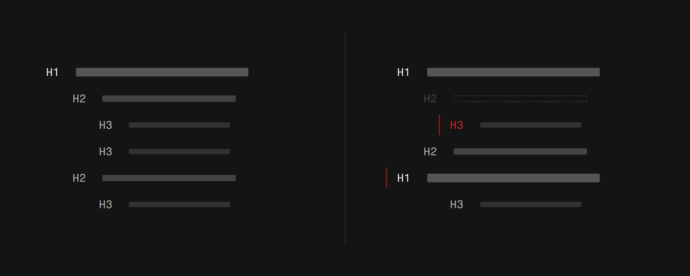
Use headings aggressively. Every scroll should reveal a new heading that tells the scanner what this section is about. If someone reads only your headings, they should still understand your page. This principle is central to what web design actually is and why it goes far beyond making things look nice.
One idea per paragraph. Two to three sentences. Then a break. Long paragraphs are walls that scanners bounce off of. Short paragraphs are stepping stones that pull people through the content.
Visual hierarchy tells people what matters. Large, bold text says "this is important." Smaller, lighter text says "this is supporting detail." If everything is the same size and weight, nothing stands out and nothing gets read.
Use whitespace generously. The space between elements is not wasted space. It's breathing room that makes content digestible. Cramped layouts feel overwhelming even if the content is good.
Forms and CTAs: Where conversions live or die
Every form is a negotiation. You're asking for someone's time and information. They're deciding if what you offer is worth the effort.
Reduce fields to the absolute minimum. Every field you remove increases completion rates. Do you really need their company size on a contact form? Ask that on the follow-up call.
Labels go above fields, not inside them. Placeholder text that disappears when you click creates a memory tax. The visitor types two letters and forgets what the field was asking for.
Error messages should be specific and helpful. "Invalid input" tells the visitor nothing. "Email address needs an @ symbol" tells them exactly what to fix. Show errors next to the field that caused them, not in a banner at the top of the page.
CTAs should describe the outcome. "Submit" is the laziest CTA on the internet. "Get Your Free Quote" tells the visitor what happens next. Good landing pages live and die by their CTA clarity.
How to measure UX (without guessing)
You don't need a UX lab. You need data and occasional reality checks.
Google Analytics tells you where people leave. High bounce rates on specific pages point to UX problems on those pages. Low time-on-page means people aren't finding what they expected.
Hotjar or Microsoft Clarity (both have free tiers) show you heatmaps and session recordings. Watch 20 recordings of real people using your site. You'll find problems you never imagined.
The five-second test. Show someone your homepage for five seconds. Then ask: "What does this site do?" and "What would you click first?" If they can't answer both, your UX needs work.
The grandmother test. Can someone with basic computer skills navigate your site and accomplish the main goal? If not, it's too complicated. This isn't about dumbing things down. It's about clarity. If you are weighing web design versus UI/UX improvements, this test helps you figure out which discipline needs more investment.
The UX checklist that actually matters
Stop before your next redesign and audit these basics first.
Can visitors find your contact info in under 5 seconds? Does the site load in under 3 seconds on mobile? Is the navigation clear and limited to 7 or fewer items? Do all buttons and links have descriptive text? Does every page have a clear purpose and call to action? Can the entire site be used comfortably on a phone? Are forms as short as they can possibly be? If you want a structured approach to auditing these fundamentals, our post on the 5 things every website needs walks through each one.
If you said no to any of these, fix those before you touch anything else. The basics beat the fancy stuff every time.
Want an honest assessment of your site's user experience? We audit websites and tell you exactly what's working, what's not, and what to fix first. Start with a free website analysis.