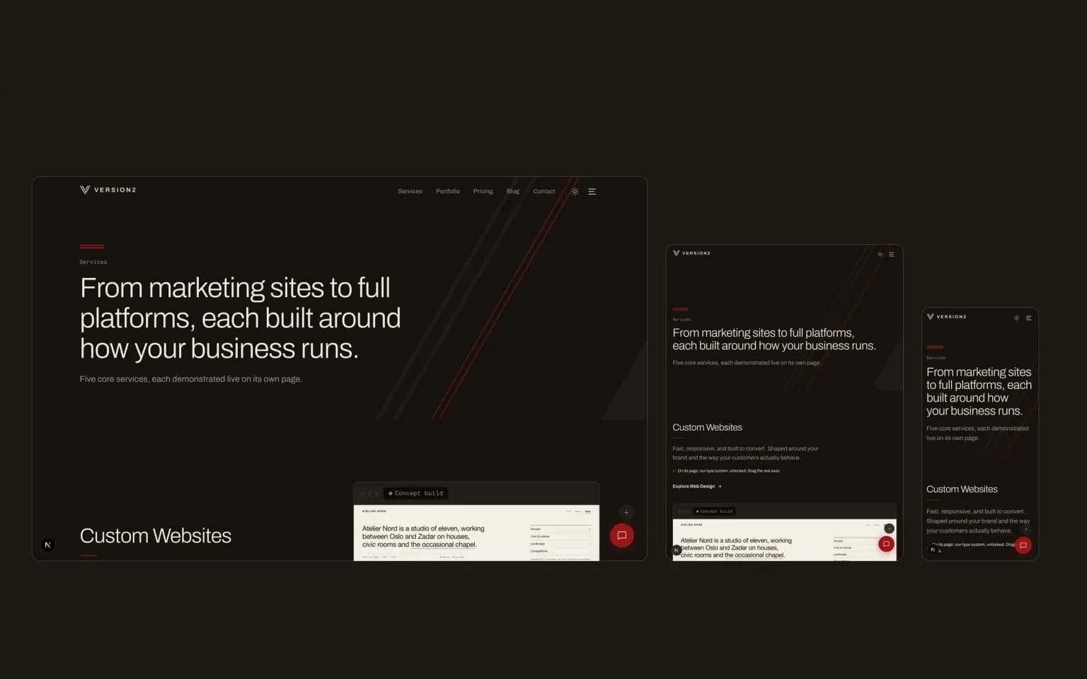
Pull out your phone and visit your own website. What do you see?
If you're pinching to zoom, scrolling sideways, or tapping tiny links with your thumb and missing, your site isn't responsive. And you're losing visitors every day because of it.
A responsive website is one that adapts its layout to fit whatever screen it's being viewed on. Phone, tablet, laptop, ultrawide monitor. Same website, same content, different presentation. The site figures out the screen size and rearranges itself accordingly.
This isn't a nice-to-have feature. It's the baseline expectation for every website built after 2015.
How responsive design works
Under the hood, responsive design relies on three core technical concepts.
Fluid grids. Instead of designing with fixed pixel widths (this sidebar is exactly 300px wide), responsive layouts use relative units like percentages. A sidebar set to 25% of the screen width works on a phone and a desktop. The proportions hold.
Flexible images. Images scale within their containers. A hero image that's 1200px wide on desktop shrinks proportionally on a phone screen instead of overflowing and creating a horizontal scrollbar.
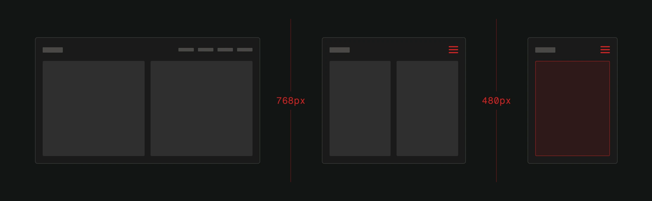
Media queries. These are CSS rules that apply different styles based on screen characteristics. At 768px wide, maybe the navigation collapses into a hamburger menu. At 480px, maybe the two-column layout becomes a single column. The designer defines these breakpoints, and the browser applies the right styles automatically.
None of this is new technology. Media queries have been supported by every major browser for over a decade. There's no technical excuse for a non-responsive site.
Why responsive design is non-negotiable
The numbers are clear. Mobile devices account for over 60% of global web traffic. In some industries and regions, it's closer to 80%. If your website doesn't work on phones, the majority of your potential visitors are having a bad experience.
But it's not just about user comfort. Responsive design affects your bottom line in measurable ways.
Google uses mobile-first indexing. This means Google primarily uses the mobile version of your site for ranking and indexing. If your mobile experience is broken, your SEO suffers regardless of how good your desktop version looks.
Bounce rates skyrocket on non-responsive sites. If a mobile visitor can't read your content or navigate your menus, they leave. Immediately. You paid for that traffic (through SEO work, advertising, or content marketing) and wasted it on a bad experience.
Conversion rates drop. People don't fill out forms, make purchases, or contact businesses through websites they have to fight with. If your call-to-action buttons are too small to tap on mobile, they might as well not exist.
Maintenance costs double. The old approach was building a separate mobile site (often on an m.example.com subdomain). This means maintaining two codebases, two sets of content, and two design systems. Responsive design eliminates this by serving one site to all devices.
What responsive design looks like in practice
Let's walk through what actually changes between screen sizes on a well-built responsive site.
Navigation. On desktop, you see a full horizontal menu bar. On mobile, it collapses into a hamburger icon that opens a full-screen or slide-out menu. Touch targets are large enough for thumbs.
Content layout. A three-column grid on desktop becomes a single column on mobile. Content stacks vertically instead of sitting side-by-side. The reading order is preserved.
Images. Different image sizes load depending on the device. A phone doesn't need to download a 2400px wide hero image when 600px would fill the screen. This saves bandwidth and improves load speed.
Typography. Font sizes, line heights, and spacing adjust so text remains readable without zooming. What works at arm's length on a monitor doesn't work at hand's length on a phone.
Forms. Input fields expand to full width. Appropriate keyboard types appear (numeric keyboard for phone numbers, email keyboard for email fields). Submit buttons are large enough to tap confidently.
Tables. Wide data tables might become scrollable cards or stacked layouts on small screens. Data stays accessible without requiring horizontal scrolling.
Common responsive design mistakes
Not all responsive implementations are created equal. Here are the mistakes we see most often.
Hiding content on mobile. If content is important enough to show on desktop, it's important enough for mobile. Hiding entire sections with display: none means mobile users get less information, not a better experience.
Touch targets that are too small. Fingers are bigger than mouse cursors. Apple recommends a minimum 44x44 pixel tap target. Google recommends 48x48. If your links and buttons are smaller than this, mobile users will misclick constantly.
Not testing on actual devices. Browser dev tools simulate responsive layouts, but they don't replicate touch behavior, real-world performance, or how your site looks in direct sunlight. Test on real phones.
Ignoring landscape orientation. People use phones in landscape mode for forms, videos, and reading. If your layout breaks or becomes unusable in landscape, you've missed a significant use case.
Slow mobile performance. Responsive layout is half the equation. The other half is performance. A beautifully responsive site that takes 8 seconds to load on a mobile connection still fails.
How to check if your site is responsive
The fastest test: open your site on your phone. If it works well, reads well, and lets you complete any task you'd do on desktop, you're probably fine.
For more detail, use Lighthouse (built into Chrome DevTools or available at PageSpeed Insights). It checks mobile usability alongside performance, accessibility, and SEO. Google's standalone Mobile-Friendly Test was retired in December 2023, but Lighthouse covers everything it did and more.
Chrome DevTools has a device simulation mode. Open your site, press F12, and click the device toggle icon. You can test various screen sizes and even simulate slower network connections.
But tools only tell part of the story. Hand your phone to someone who hasn't used your site before. Ask them to find your phone number, read a specific service page, or fill out your contact form. Watch where they struggle.
The user experience connection
Responsive design isn't a standalone feature. It's part of the broader user experience. A responsive layout that's confusing to navigate is still a bad website. A responsive site that loads slowly still frustrates users.
Think of responsiveness as the foundation. It ensures your site is physically usable on any device. Everything else, clear content, intuitive navigation, fast performance, persuasive design, builds on top of that foundation.
If the foundation is broken, nothing built on top of it matters.
Not sure how your site performs on mobile? We'll take a look. Our free website analysis covers responsiveness, speed, and usability across all devices.