
Pull out your phone. Open your own website. Scroll around. Try to fill out a form. Try to read a full page of text.
If anything feels awkward, pinch-to-zoom is required, or buttons are too small to tap, you have a problem. And that problem is costing you money every single day.
The numbers don't lie
More than 60% of all web traffic worldwide comes from mobile devices. In some industries, it's closer to 80%. And the gap keeps widening.
But here's what makes it worse. Google uses mobile-first indexing. That means Google looks at the mobile version of your site first when deciding where to rank you. If your mobile experience is bad, your SEO suffers regardless of how nice your desktop version looks.
A non-responsive site is like a store with the front door jammed shut. Your product might be great, but nobody's getting in.
What responsive design actually means
Responsive design means your website adapts its layout, images, and navigation to fit whatever screen it's viewed on. Phone, tablet, laptop, ultrawide monitor. One site. Every size.
This isn't about building a separate "mobile version." That approach died years ago for good reason. Maintaining two versions of a site is twice the work, twice the bugs, and half the consistency.
True responsive design uses flexible grids, fluid images, and CSS media queries to rearrange content based on screen width. A three-column layout on desktop becomes a single column on mobile. Navigation collapses into a menu. Images resize without losing quality. Text stays readable without zooming.

The goal is simple. No matter how someone accesses your site, the experience should feel intentional. Not like a desktop site that got squeezed into a smaller box.
What happens when you ignore it
The consequences are immediate and measurable.
People leave. If a mobile user has to pinch, zoom, and scroll sideways to read your content, they won't. They'll hit the back button and go to a competitor whose site actually works on their phone. Studies consistently show that over half of mobile users abandon sites that take more than three seconds to load or are difficult to navigate.
Google pushes you down. Mobile-friendliness is a direct ranking factor. A site that doesn't work on mobile gets penalized in search results. Your competitors who invested in responsive design show up above you. Full stop.
Conversions tank. Even if someone does stick around on your clunky mobile site, they're less likely to buy, sign up, or contact you. Forms that are hard to fill out on a phone don't get filled out. Buttons that are hard to tap don't get tapped. Every bit of friction costs you.
Your brand takes a hit. A broken mobile experience tells visitors something about your business. It says you don't pay attention to details. It says you're behind the times. First impressions happen fast, and a bad mobile experience is a bad first impression.
The building blocks of good responsive design
Getting responsive design right involves more than just shrinking things down. Here's what actually matters.
Fluid layouts
Forget fixed pixel widths. A responsive layout uses relative units like percentages, viewport units, and CSS flexbox or grid. Content flows naturally to fill available space. Nothing breaks when the screen size changes.
Flexible images and media
Images should scale with their container without overflowing or losing aspect ratio. The srcset attribute lets you serve different image sizes to different devices, so mobile users aren't downloading a 4MB hero image meant for a 27-inch monitor. This directly impacts page speed.
Touch-friendly interactions
Mobile users tap. They don't hover. Navigation menus need to work without hover states. Buttons need to be big enough to hit with a thumb. Form fields need adequate spacing. Links that are too close together become impossible to tap accurately.
Typography that scales
Text needs to be readable at every size without manual zooming. This means base font sizes of at least 16px on mobile, sufficient line height, and enough contrast against the background. Responsive typography using clamp() in CSS lets text scale smoothly between minimum and maximum sizes.
Performance first
Mobile networks are slower than WiFi. Mobile devices have less processing power. A responsive site that's technically correct but takes 8 seconds to load on 4G is still failing its mobile users. Optimize images, minimize code, and test on real devices with real network conditions.
How to check if your site passes
Start with Lighthouse, available through Chrome DevTools or Google's PageSpeed Insights. It evaluates mobile usability alongside performance, accessibility, and SEO. (Google retired its standalone Mobile-Friendly Test in December 2023, but Lighthouse covers all the same checks and more.)
Then go deeper. Open your site on an actual phone. Not just a browser resize. Actual phones have different rendering engines, touch targets, and performance characteristics. Test on both iOS and Android.
Check your analytics. Look at bounce rate by device type. If mobile bounce rate is significantly higher than desktop, your responsive design needs work. Look at conversion rate by device. If mobile converts at a fraction of the desktop rate, there's friction somewhere.
Run a speed test specifically for mobile. Page speed impacts both user experience and search rankings. Aim for under 3 seconds on a mobile connection.
Common mistakes we see
Hiding content on mobile. If content is important enough to show on desktop, it's important on mobile too. Hiding sections with display: none doesn't remove them from the page load. It just hides them from users who might need them most.
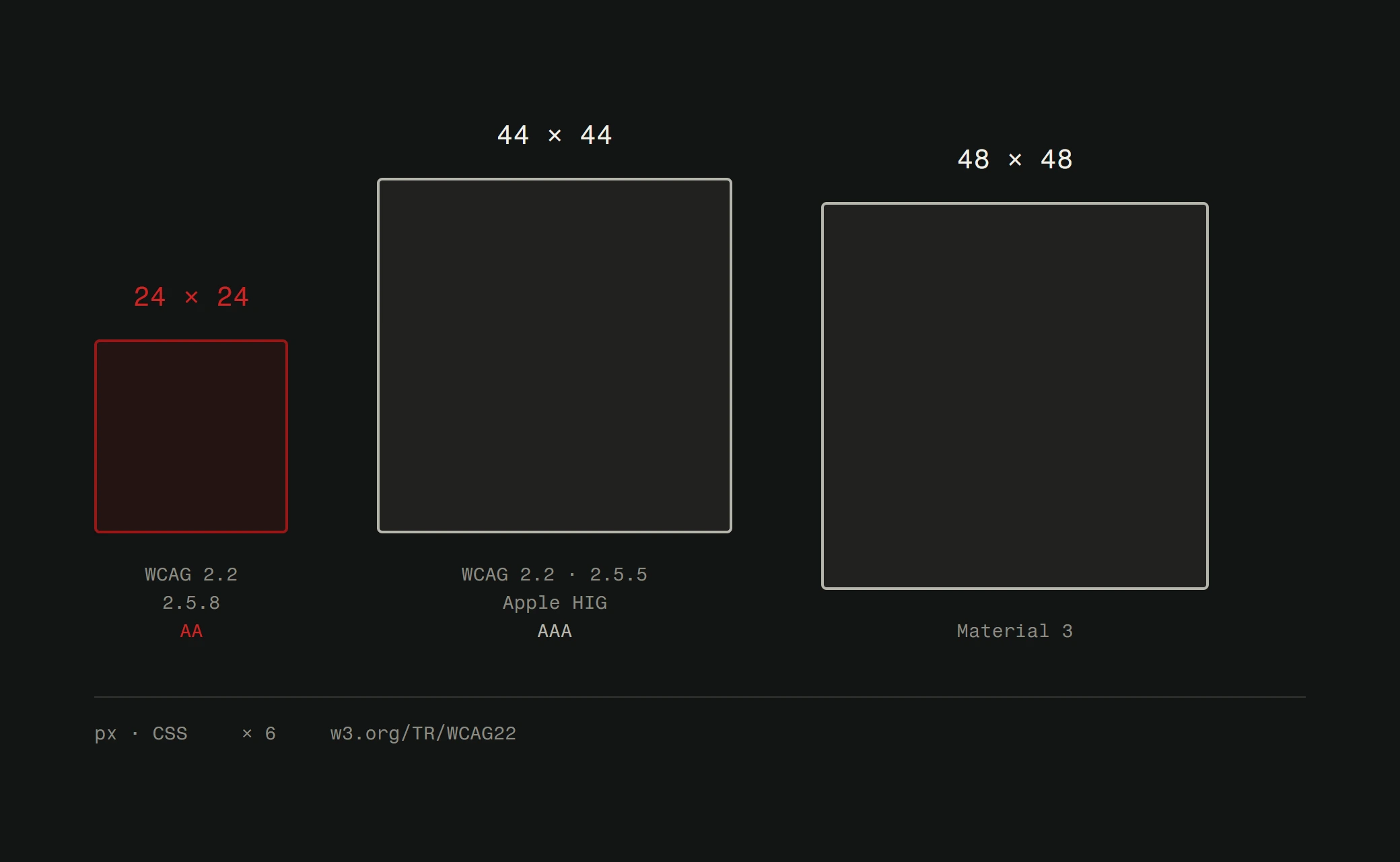
Tiny tap targets. Buttons and links need at least 44x44 pixels of tappable area. Anything smaller frustrates users.
Unoptimized images. The single biggest performance killer on mobile. Serve appropriately sized images using responsive image techniques.
Ignoring landscape orientation. People hold their phones sideways sometimes. Your layout should handle it.
Not testing on real devices. Browser dev tools simulate responsiveness, but they don't replicate real-world performance. Test on actual hardware. If you want a deeper understanding of what responsive design means and how it works technically, we have a dedicated explainer.
It's not optional anymore
Responsive design stopped being a "nice to have" years ago. It's a baseline requirement. Like having a website at all. If your site hasn't been updated in years, it may be time to consider how often you should redesign and whether a mobile-first rebuild is the right move.
If your site doesn't work on mobile, you're invisible to Google, frustrating to visitors, and losing business to competitors who got this right. The fix doesn't have to be complicated, but it does have to happen.
Need a site that works on every device without compromise? Check out how Version2 handles web design or get a free website analysis to see where yours stands.