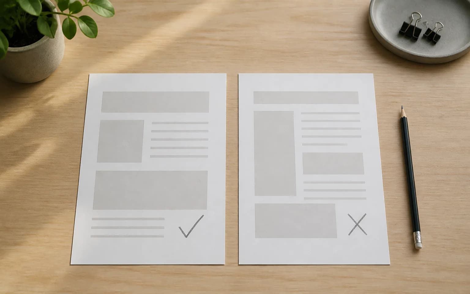
There's a reason some websites feel right the moment you land on them. Everything's where you expect it. The text is easy to read. You find what you need fast. You don't even think about the design. It just works.
Then there are the other websites. The ones where you squint at tiny text over a busy background, hunt for the navigation, and leave within 10 seconds.
The difference isn't talent or budget. It's knowing which rules to follow and which mistakes to avoid. Let's break it down.
Do: Put function before everything
A website's job is to help people do something. Buy a product. Learn about a service. Get contact information. Everything else is secondary.
A gorgeous site that confuses visitors is worse than a plain site that's crystal clear. Before you worry about animations, color gradients, or that parallax effect you saw on Awwwards, ask one question: can a first-time visitor accomplish their goal in under 30 seconds?
If the answer is no, the design needs work. Pretty doesn't pay the bills. Clarity does.
Don't: Overload the visual design
You know that restaurant with 200 items on the menu? You can't decide, so you order the safe option or leave.
Websites work the same way. Too many colors, fonts, images, and competing elements create visual chaos. The user's brain can't figure out what to focus on, so they focus on nothing.
Stick to two or three colors. Use one font family (two at most). Leave plenty of white space. Every element on the page should have a clear reason for being there. If you can't explain why something exists, remove it.
Do: Nail your typography
Typography is the most underrated element in web design. Most of your website is text. If the text is hard to read, nothing else matters.
Here's what works:
- Base font size of 16px minimum. Anything smaller strains eyes on screens.
- Line height of 1.5 to 1.6 for body text. Tight line spacing kills readability.
- High contrast between text and background. Gray text on a light gray background looks "modern" and is terrible to read.
- Limit line width to around 65-75 characters. Lines that stretch across the full screen are exhausting to read.
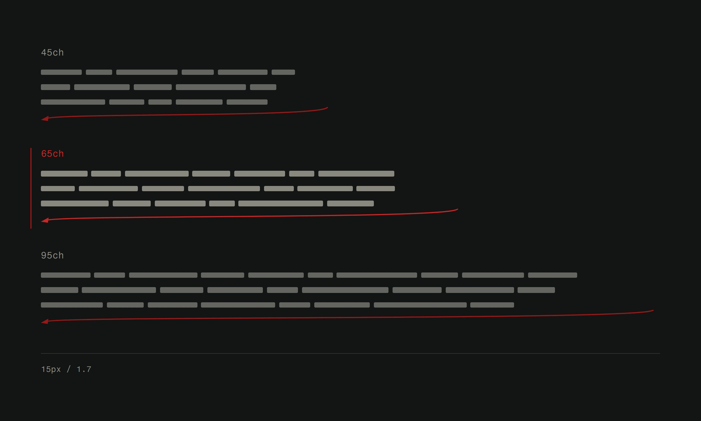
Good typography is invisible. People read your content without effort. Bad typography is a wall between your message and your audience.
Don't: Forget about mobile
Over 60% of web traffic is mobile. If your site doesn't work on phones, the majority of your visitors are having a bad time.
Responsive design isn't optional. It hasn't been for years. Buttons need to be big enough to tap. Text needs to be readable without zooming. Forms need to be easy to fill out on a touchscreen. Navigation needs to work without hover states.
Test your site on actual phones. Not just a browser resize. The difference between the two is real, and your visitors will notice it.
Do: Make navigation obvious
People should never have to think about how to get around your site. Navigation should be visible, consistent, and logical.
Put your main navigation where people expect it. Top of the page or left sidebar. Use clear, descriptive labels. "Services" is better than "What We Do." "Contact" is better than "Let's Talk." Save the creativity for your content, not your nav labels.
Breadcrumbs help on deeper sites. A search function helps on content-heavy sites. And every page should make it easy to get back to the homepage. These aren't exciting features. They're essential ones.
Don't: Ignore page speed
A beautiful site that takes 5 seconds to load isn't beautiful. It's abandoned.
Users expect pages to load in under 3 seconds. Google uses page speed as a ranking factor. Every second of delay drops your conversion rate.
The usual culprits: unoptimized images (the biggest offender by far), too many third-party scripts, render-blocking CSS and JavaScript, no caching strategy, and bloated page weight from unnecessary frameworks.
Test your speed with Google PageSpeed Insights. If your score is below 80, start optimizing. The returns are immediate.
Do: Design for accessibility
Accessibility isn't a nice-to-have checkbox. It's about making your site usable for everyone, including people with visual impairments, motor disabilities, or cognitive differences.
The basics aren't hard. Sufficient color contrast. Alt text on images. Keyboard navigation support. Proper heading hierarchy. Form labels that screen readers can understand.
An accessible site is also a better-designed site. The principles overlap almost completely with good UX design. When you design for the widest range of users, everyone benefits.
Don't: Use autoplay anything
Auto-playing videos with sound are the fastest way to make someone close your tab. Auto-playing background videos that slow down the page are the second fastest.
If you have video content, let users choose to play it. If you must use a background video, make it silent, lightweight, and non-essential. The content should work perfectly without it.
The same goes for auto-playing carousels and sliders. Studies consistently show that people ignore them. The first slide gets some attention. Everything after it might as well not exist.
Do: Write content people actually want to read
Design and content are inseparable. A well-designed site with garbage content fails. A content-rich site with decent design succeeds.
Write for your audience, not for yourself. Use language they use. Answer questions they actually have. Get to the point fast. Break up long text with subheadings, short paragraphs, and occasional lists.
And care about SEO while you're at it. Use proper heading structure (one H1, logical H2s and H3s). Write meta descriptions that make people want to click. Include relevant keywords naturally, not stuffed into every sentence.
Don't: Copy what looks cool without understanding why
The most common design mistake we see? Copying a trend because it looks cool on someone else's site without understanding the purpose behind it.
That massive full-screen video hero? It works for a film production company. It doesn't work for your accounting firm. That hamburger menu on desktop? It works for a minimal portfolio. It hides your navigation from everyone else.
Design decisions should be driven by your users' needs, your content, and your goals. Not by what won a design award last month.
The bottom line
Good web design follows a pattern. It puts users first. It removes friction. It communicates clearly. It loads fast. It works on every device.
Bad web design puts the designer's ego first. It prioritizes style over substance. It makes visitors work to find what they need.
The rules aren't complicated. Follow the ones that serve your users, and you'll be ahead of most websites on the internet.
Want a site that follows all the right rules and breaks none of the wrong ones? See how Version2 approaches web design or start with a free website analysis.