Open ten websites in the same industry. Nine of them will look like the same site with different logos. Same layout. Same stock photography. Same blue buttons.
This is the default state of web design. Most businesses end up with a generic site because generic is safe. Nobody gets fired for choosing a template that looks "professional." But nobody remembers it either.
A strong visual identity is one of the few things that can make your site stick in someone's memory. Here is how to build one.
Typography is your strongest brand signal
If you change nothing else about a website except the typography, it will feel like a completely different site. That is how much weight fonts carry.
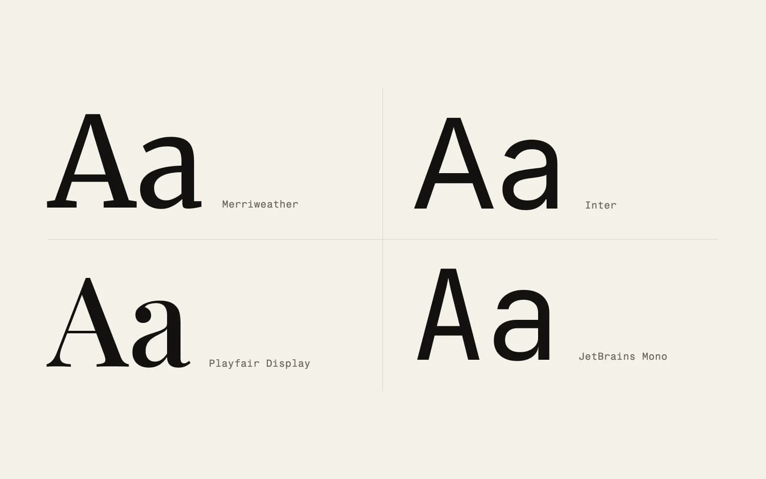
Most websites default to system fonts or safe choices like Inter, Open Sans, or Roboto. These are good fonts. They are also invisible. Nobody has ever remembered a brand because it used Open Sans.
Custom or distinctive typefaces signal intentionality. They tell visitors that someone actually thought about this. That every detail was considered. Companies like Spotify and Airbnb invested in custom typefaces because they understood this.
You do not need a custom-designed font to stand out. You just need to be intentional about your choices. Picking the right typeface means understanding your brand personality and finding a font that expresses it without sacrificing readability.
A few practical guidelines. Limit yourself to two typefaces maximum, one for headings and one for body text. Make sure your body font is legible at small sizes on screens. Test your heading font at large sizes to confirm it has the character you want. And always, always check how your fonts render on Windows. A font that looks beautiful on a Mac can look terrible on a PC.
Illustration over stock photography
Stock photography is a visual dead end. Your audience has seen the same handshake photo, the same laptop-on-a-desk, the same diverse-team-around-a-whiteboard on a hundred other websites. These images communicate nothing about your specific brand.
Custom illustration is one of the most effective ways to create a distinct visual language. Illustration styles are infinitely varied. They can be minimal or detailed, geometric or organic, playful or serious. The style you choose becomes part of your brand vocabulary.
You do not need to illustrate every page. Even a consistent set of icons and spot illustrations for key pages creates coherence. The important thing is consistency. One illustration style used throughout is far more powerful than a mix of different approaches.
3D illustration has become more accessible thanks to tools like Blender and Spline. A well-executed 3D visual can add depth and dimension that flat design cannot match. But "well-executed" is the key phrase. Bad 3D looks worse than no 3D. If you go this route, invest in quality.
Color as strategy, not decoration
Color affects how users perceive and interact with your site more than most people realize. It is not just about looking good. It is about communication.
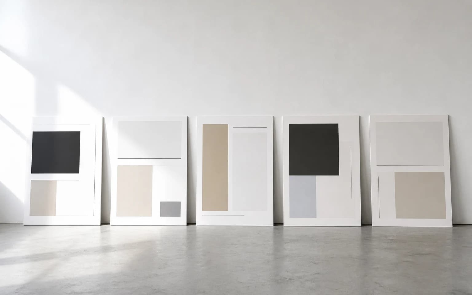
Your color palette should do three things. First, it should differentiate you from competitors. If every competitor uses blue, maybe blue is not your best choice. Second, it should create visual hierarchy. Users should be able to scan your page and understand the structure through color alone. Third, it should be accessible. Contrast ratios matter. Color-blind users are roughly 8% of the male population.
A tight color system works better than a broad one. Pick one primary color, one or two accent colors, and a set of neutrals. Use the accents sparingly for calls to action and important elements. The more restrained your palette, the more impact your accent colors carry.
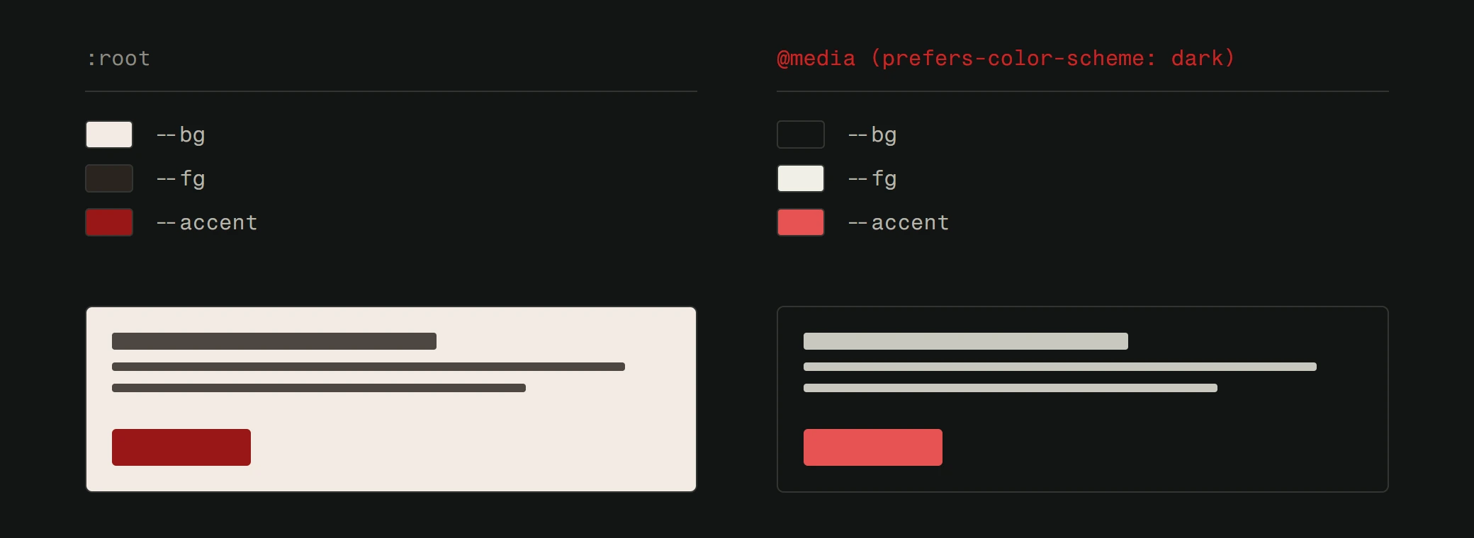
Dark color schemes have moved beyond a trend and into a legitimate design approach. They reduce eye strain, save battery on OLED screens, and can make visual content pop. But they need careful contrast management. Dark mode is not just "invert the colors." It requires its own set of carefully chosen shades and tested contrast ratios.
Motion with purpose
Animation on a website can either enhance or destroy the experience. The difference comes down to intent.
Purposeful motion guides users. A subtle animation on a button confirms that a click registered. A smooth transition between pages maintains spatial context. A loading indicator keeps people from wondering if the site is broken.
Decorative motion is a different story. Parallax effects that make scrolling feel sluggish. Entrance animations that delay content visibility. Scroll-jacking that takes control away from the user. These prioritize spectacle over usability.
The best motion design is barely noticeable. It feels natural, like the interface is responding to your actions rather than performing for you. If a user comments on your animations, they are probably too prominent.
Performance is the other consideration. Every animation consumes processing power. On lower-end devices, heavy animations create lag, stutter, and frustration. Test your animations on a mid-range phone, not just your developer's MacBook Pro. If they do not run smoothly on a three-year-old Android phone, simplify them.
Nostalgia and personality
There is a growing countermovement against the polished, corporate web. Some brands are deliberately embracing rougher aesthetics. Hand-drawn elements. Retro typography. Intentional imperfection.
This works when it is authentic. A creative studio or an indie brand can pull off a raw, expressive visual identity because it matches their personality. A law firm probably cannot.
The Y2K revival, pixel art, brutalist design, and other retro-inspired approaches are not just nostalgia trips. They are reactions to a web that has become visually homogeneous. They stand out precisely because they break the rules that everyone else follows.
But breaking rules effectively requires understanding them first. The best "rule-breaking" designs are made by people who deeply understand typography, composition, and hierarchy. They know which rules to break and which ones hold everything together.
Consistency is the multiplier
Individual design choices matter less than consistency across all of them. A distinctive typeface paired with stock photography sends mixed signals. Custom illustrations on the homepage but generic icons on inner pages feel disjointed.
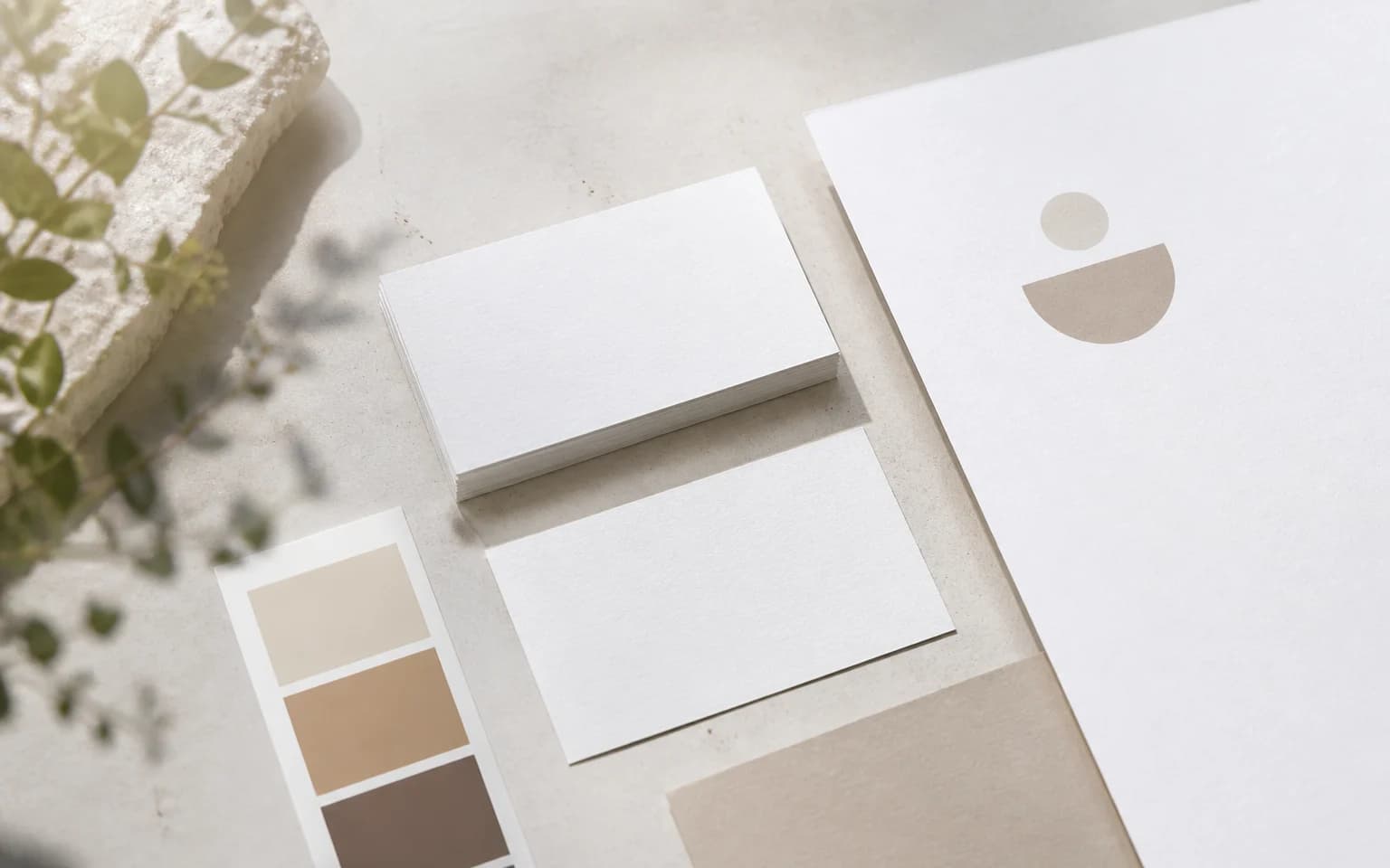
Visual identity works through repetition. When every touchpoint, every page, every component reflects the same design language, the cumulative effect is far greater than any single element. This is why design systems exist. They are not about efficiency alone. They are about maintaining a coherent identity at scale.
Document your choices. Create a simple style guide that covers typography, color, illustration style, spacing, and tone. This ensures that whoever works on the site next, whether that is you in six months or a new team member, maintains the visual identity rather than eroding it.
Standing out is a choice
The default path leads to another generic website. Standing out requires intentional decisions about typography, color, illustration, and motion. It requires saying no to the template and yes to a point of view.
This does not mean being weird for the sake of it. It means understanding your brand, your audience, and your competitors well enough to make design choices that are distinctly yours. That is how you build a site people remember.
Ready to build a website with a real visual identity? See how we approach custom web design and what makes it different from templates.