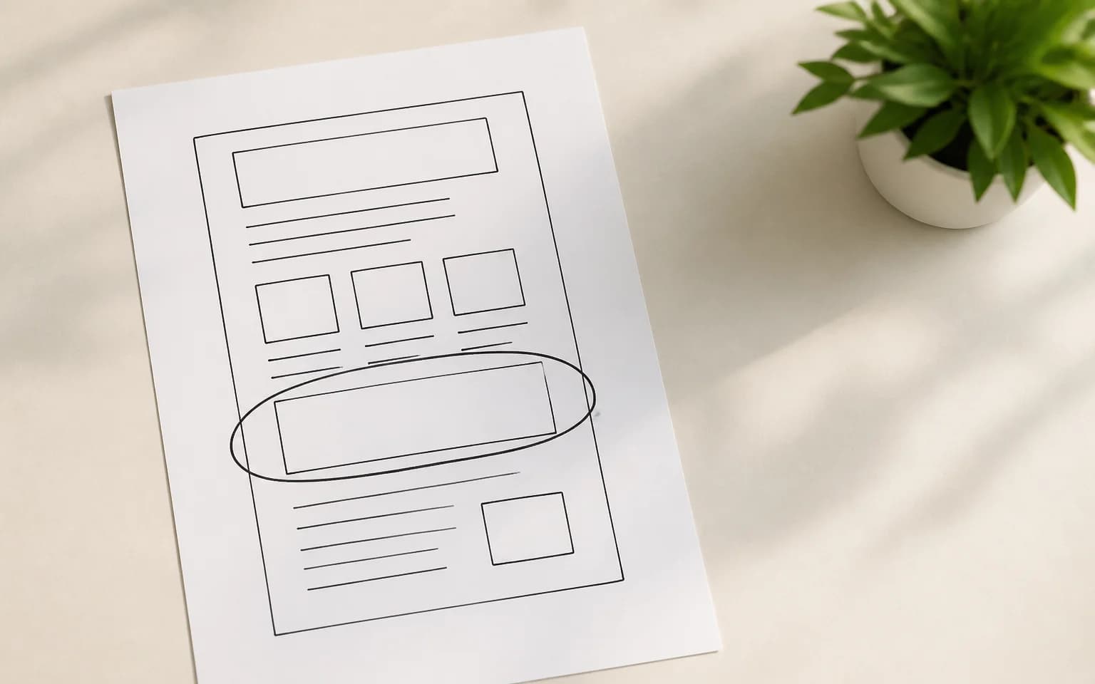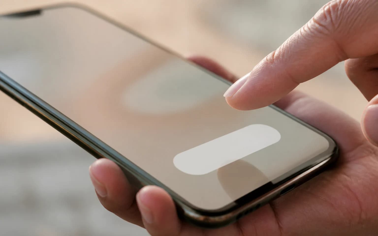
Your website's most important elements are probably the smallest. Call-to-action buttons occupy maybe 2% of your page's real estate but account for nearly 100% of conversions. If your CTAs aren't working, your website isn't working. It's that simple.
The average click-through rate for a website CTA is around 4%. The best performers hit 10-15%. That gap represents real revenue. Let's close it.
Why most CTAs fail
Three reasons cover about 90% of underperforming CTAs.
They're vague. "Click Here" and "Learn More" and "Submit" tell the user nothing about what happens next. Clicking is a micro-commitment. People need to know what they're committing to before they'll do it.
They're invisible. The CTA looks like every other element on the page. Same color as the navigation. Same size as body text. Same visual weight as everything around it. If a user has to hunt for the action button, most won't bother.
They ask too much too soon. A first-time visitor doesn't want to "Schedule a Demo" or "Start Your Free Trial." They just got here. They're still figuring out what you do. Matching your CTA to the user's stage in the journey matters more than the words on the button.
Writing CTA copy that converts
The text on your button is the final nudge before someone takes action. Every word counts.
Start with the value, not the action
"Get Your Free Guide" outperforms "Download" by a wide margin. The first tells the user what they receive. The second tells them what they have to do. People care about outcomes, not tasks.
More examples:
- "See Pricing" beats "Click Here"
- "Start Building for Free" beats "Sign Up"
- "Get My Results" beats "Submit"
- "Reserve My Spot" beats "Register"
The pattern: frame it as what the user gets, not what the user does.
Be specific
Specificity builds confidence. "Get 15 Landing Page Templates" is more compelling than "Get Resources." "Save 3 Hours a Week" is more compelling than "Improve Efficiency."
If you can add a number, a timeframe, or a concrete deliverable, do it. Vague promises feel like traps. Specific promises feel like transactions.
Create honest urgency
Fake urgency (countdown timers on unlimited digital products, "Only 3 left!" that resets every day) erodes trust. Real urgency works.
"Early bird pricing ends March 15" is honest urgency. "Limited spots: 8 of 20 remaining" is honest urgency if it's true. "Get this before it's gone!" with no actual scarcity is manipulation, and users increasingly see through it.
Use first person
"Start My Free Trial" typically outperforms "Start Your Free Trial." The first person creates a sense of ownership. The user mentally says it to themselves as they read it. Small psychological shift, measurable conversion lift.
Designing CTAs that get noticed
Copy gets the click. Design gets the attention.
Contrast is king
Your CTA button needs to be the highest-contrast element in its section of the page. This is color theory applied to business results.
The specific color matters less than the contrast ratio. An orange button on a blue page pops. A blue button on a blue page vanishes. Pick a color for your CTA that appears nowhere else on the page except for interactive elements.
Size and space
Make the button big enough to be a confident click target. The minimum touch target size for mobile is 44x44 pixels (Apple's guideline) or 48x48 pixels (Google's Material Design). For primary CTAs, go bigger.
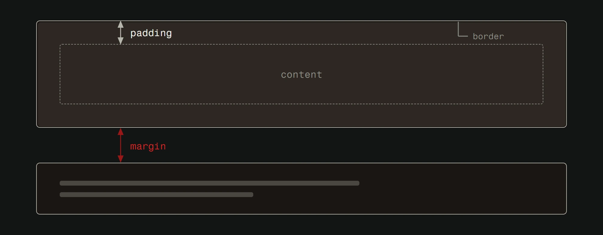
Equally important: whitespace around the button. A CTA crammed between paragraphs of text gets lost. Give it room to breathe. The empty space around a button is part of what draws the eye to it.
One primary CTA per screen
When you give users too many options, they choose none. This is the paradox of choice, and it kills conversion rates.
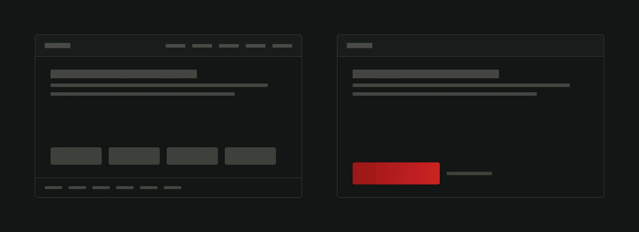
Every screen (viewport-sized section) of your page should have one clear primary action. You can have a secondary action with less visual prominence, but the primary CTA needs to be obviously the main thing to do.
Two equally-prominent buttons side by side ("Buy Now" and "Learn More" in the same size and color) create decision paralysis. Make one bigger, bolder, and more prominent than the other.
CTA placement strategy
Where your CTA sits on the page matters as much as what it says.
Above the fold (but not alone)
Your primary CTA should appear above the fold, meaning visible without scrolling. But it needs context. A "Buy Now" button with no headline, no value proposition, and no supporting content above it is just a button in a void.
The formula: Headline + supporting sentence + CTA. Give the user just enough context to understand the offer before asking for the click.
After each value section
For longer landing pages, repeat your CTA after each section that adds value. After your features section. After your testimonials. After your pricing table. Users who are ready to convert shouldn't have to scroll back up to do it.
Sticky CTAs for mobile
On mobile, a sticky CTA bar at the bottom of the screen keeps the action accessible as users scroll. This is especially effective for e-commerce product pages and service-based landing pages.
Keep it simple: a single button with 2-4 words. The sticky bar should feel helpful, not intrusive.
Exit-intent and scroll-depth triggers
Pop-up CTAs triggered by exit intent (mouse moving toward the browser's close button) or scroll depth (user has read 70% of the page) can capture visitors who are about to leave.
These work when the offer is different from the main page CTA. If your page asks visitors to "Buy the Course" and the exit pop-up asks "Want 3 Free Lessons?", that's a lower-commitment offer that catches people who weren't ready for the full purchase.
Testing your CTAs
Stop guessing. Start measuring.
A/B test one variable at a time. Button color this week. Copy next week. Placement the week after. If you change everything at once, you learn nothing.
Track click-through rate AND conversion rate. A CTA that gets clicked but doesn't convert downstream has a different problem than a CTA that doesn't get clicked at all. Know which problem you're solving.
Run tests for at least 100 conversions per variation. Small sample sizes produce unreliable results. A "50% improvement" based on 8 vs 12 clicks is noise, not signal.
Test the boring stuff first. Button color and placement tend to have bigger impacts than copy tweaks. Start with the high-impact variables before wordsmithing.
CTAs beyond buttons
Buttons aren't your only option.
Inline text links. Within blog posts and content pages, natural text CTAs often outperform buttons because they feel like helpful suggestions rather than sales pressure. "Here's how to check your site speed" is a CTA disguised as content.
Form CTAs. A simple email capture form with a compelling headline can outperform a button that leads to a separate signup page. Reduce the number of steps between interest and action. For tips on improving your overall web design, CTA placement is one of the highest-impact changes you can make.
Chat prompts. A well-timed chat widget message ("Need help choosing a plan?") acts as a CTA that offers immediate assistance. These work well on pricing pages and comparison pages.
Content upgrades. A downloadable checklist, template, or tool offered within relevant content. "Get the full SEO checklist" at the end of an SEO article is a natural next step that converts well.
The bottom line
Good CTAs come down to three things: say what happens when they click, make it easy to see, and ask at the right time. Everything else is optimization on top of those fundamentals.
Start with clear copy, strong contrast, and strategic placement. Then test, measure, and iterate based on real data from real users. The difference between a 4% and a 12% click rate is the difference between a website that costs you money and one that makes it. If you want to see how CTAs fit into the full website creation process, they're a key part of every phase from design through launch.
Want a conversion review of your current website? Get in touch and we'll identify the quick wins hiding in your CTAs.